Baruch
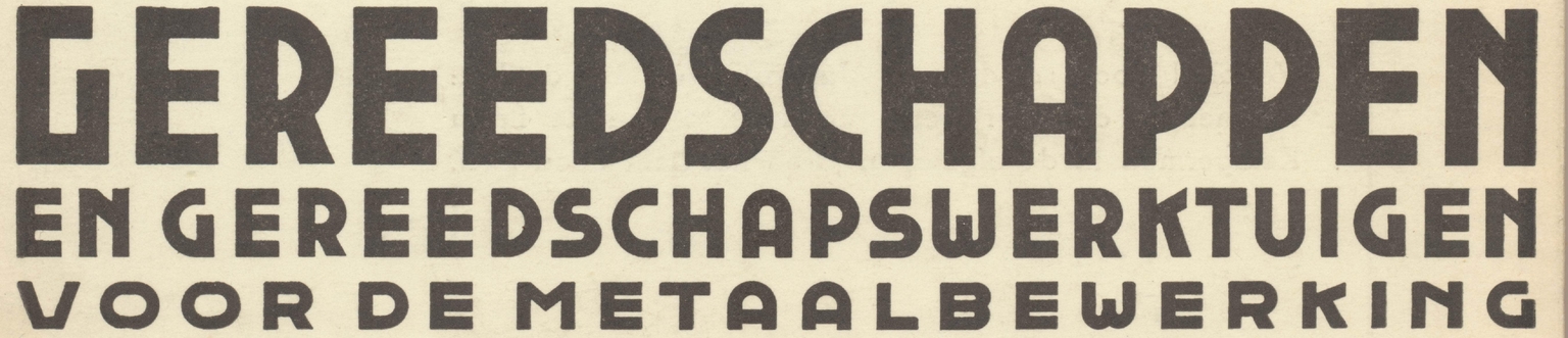
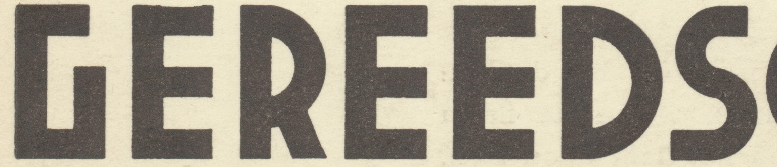
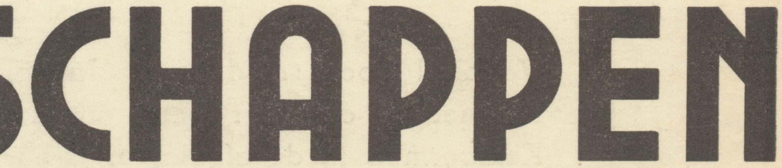
Baruch is a geometric sans typeface designed by Ramiro Espinoza and inspired by the modular, somewhat inconsistent lettering found on the cover of the Dutch technical handbook Gereedschappen en gereedschapswerktuigen voor metaalbewerking, written by B. van Rees and published in Haarlem in 1938 by N.V. Uitgeversmaatschappij v/h A. Kemperman. The original letterforms, likely constructed with simple geometric principles, have a direct and utilitarian quality that reflects the publication’s industrial subject matter.
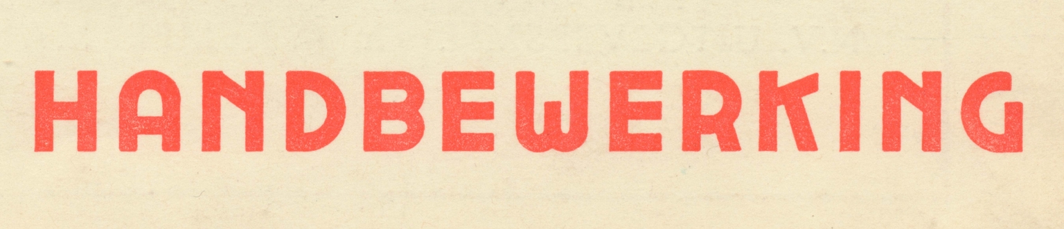
Espinoza used these imperfect but engaging shapes as the basis for a digital typeface, refining their structure, balancing proportions, and expanding the character set while retaining the straightforward geometry that gives the source its charm. The result is Baruch, a clean and functional sans serif suitable for posters, signage, visual identities, websites, editorial design, and projects seeking a rational yet historically grounded typographic voice.
