Floor Wesseling, mixing cultures and identities
Graphic design runs in Floor Wesseling’s blood; it was passed down from father to son. Just like his father, Rolf, Floor Wesseling studied at the Gerrit Rietveld Academie. He runs a nine-person creative design studio based in Amsterdam. Yves Peters sat down with him for a video interview.
How did you start in graphic design?
At fourteen, I started doing graffiti. My serious graffiti career began two years later, when I dared to work at night in railway yards. I learned to rapidly convert my letter sketches and designs on scrap paper into large-scale drawings with the correct proportions and contrast on trains or underground carriages, without getting caught – hence the need for speed. 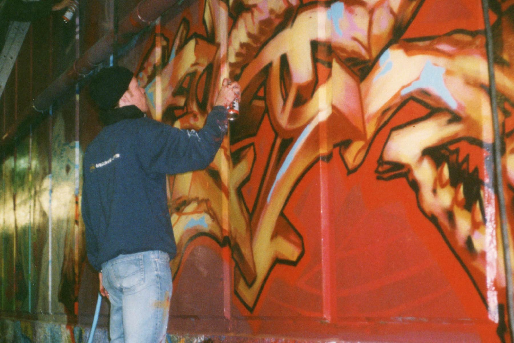
One thing led to another. By 1994–95, Amsterdam DJs began commissioning painted backdrops and, later, flyers from me, mainly for house music, drum-and-bass, and the like. They always asked for experimental designs. I was self-taught and designed everything in CorelDRAW. Together with the boys with whom I did graffiti, I figured after a while that we should learn design “for real” at a bona fide art academy. The first time I applied to Rietveld, they turned me down because, they said, my work was “too graffiti.” But I didn’t let that deter me: I had my mind set on becoming an excellent graphic designer. That was the level we were aiming for. So I did a preparatory trajectory, where it turned out I could draw really well. The department head wanted to steer me toward the Fine Arts department to become a painter. However, I was determined to pursue graphic design.
Rather than interning or working at a design studio, I dove headfirst into freelancing upon graduating from the Graphic Design department in 2002. It meant I had to figure out everything by myself. Just like my father, I was very much into typography. When I was between ten and twelve years old, he had me set type using Letraset rub-down lettering in his design studio during the summer holidays. Then came computers. I learned to work with them alongside my father. After CorelDRAW came QuarkXPress. Creating those DJ flyers in the nineties, on the one hand, made me aware of letterforms and helped me understand how typography works, even without any formal education. That decade also saw the rise of digital typography, with new rules. My background in graffiti, on the other hand, taught me how letterforms communicate, how they conjure up associations and emotions, and how they operate when combined into words.
So, graffiti made you realize how typography influences the perception of the message?
Indeed, I still use this motivation, this intent in my work. Just the shape of a single character can set the tone. A lowercase a becomes a little person. You can discern an eye, a mouth… It stems from my experience with graffiti, from the Letraset exercises my father had me do, from redrawing Lego brochures using an overhead projector. I’ve also drawn a lot of Helvetica by hand.
I received a comprehensive education in typography at the Rietveld Academy. I was taught by Experimental Jetset. While I still think they’re great, they don’t do what I do. Their dogmatic use of Helvetica is opposite to the Rietveld way of thinking. I also learned a lot from my design hero, Wim Crouwel, with whom I collaborated on a typeface design in 2013. The semester I studied under him made me realize what I did and didn’t want to do. Wild Plakken were radical; they had a completely different approach to teaching. Roger Willems’s guest lectures taught me to use photocopiers and other analogue techniques. And I learned calligraphic techniques from Gerard Unger.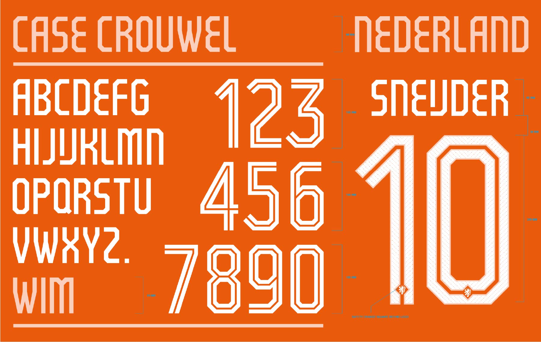
You started as a graffiti artist. Did that inform your later socially conscious work?
Not really. Standing up for minorities and for social justice is rooted more in growing up in a disadvantaged neighborhood than in my background in graffiti. There wasn’t anything to do, and we wanted more out of life. Hip-hop was a cultural shift. You simply had to join if you were creative. That’s when I learned to develop campaigns, paint graffiti, and design flyers with my friend Michiel Schuurman. Then, at Rietveld Academie, I transitioned from spray cans to pasting posters and images on walls. We found a niche, an alternative way of campaigning and advertising using low-budget and anarchistic techniques, that worked for organizations that accepted these methods. Gradually, we were able to apply the same strategies for established brands like Nike.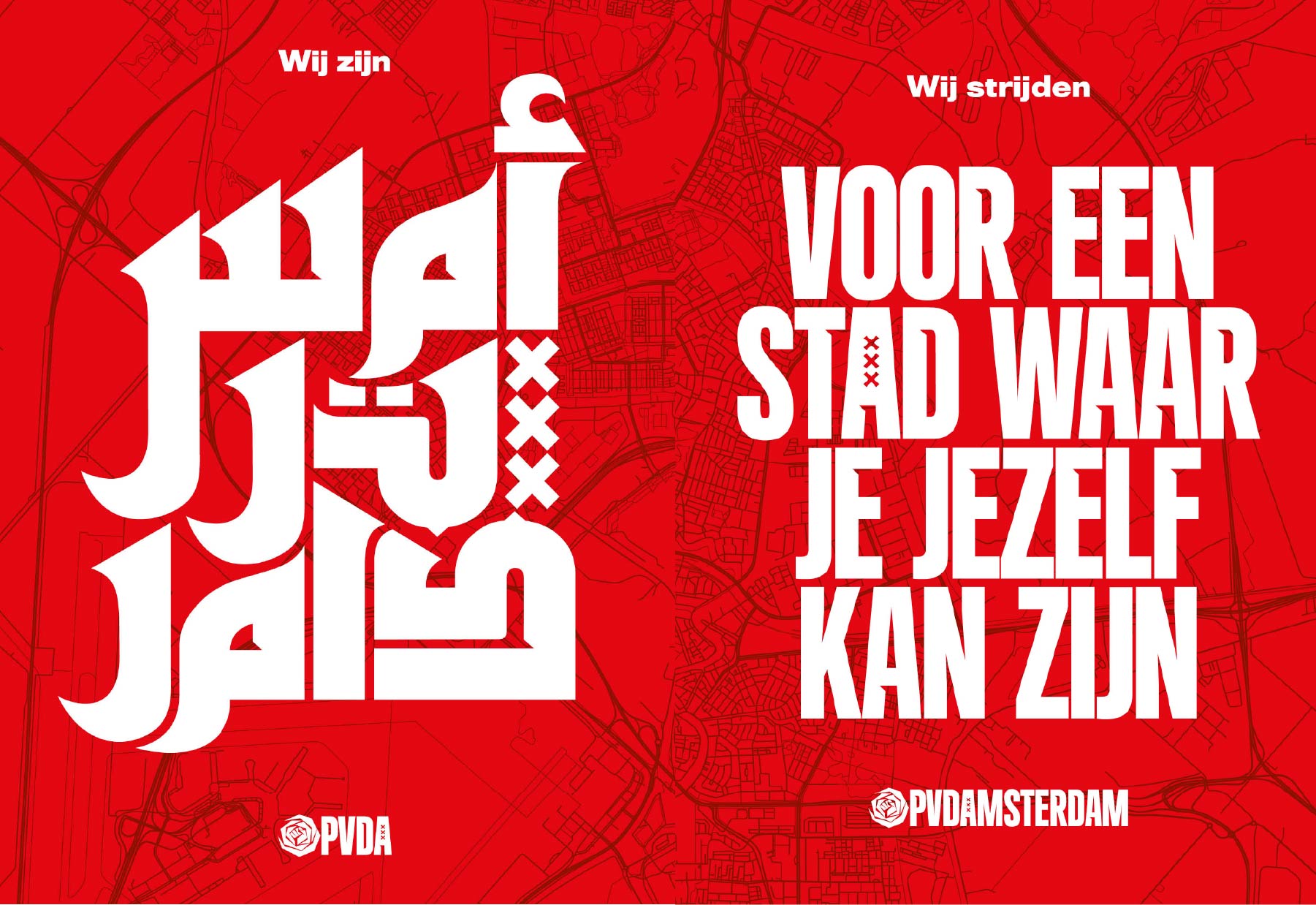
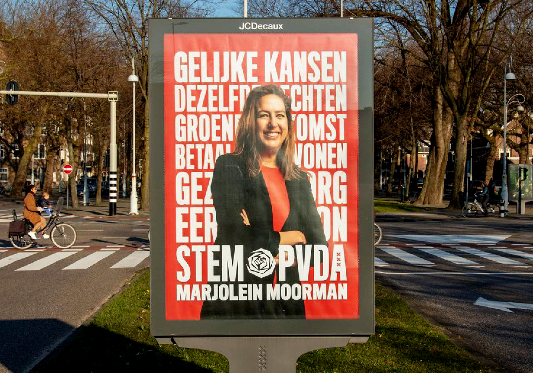
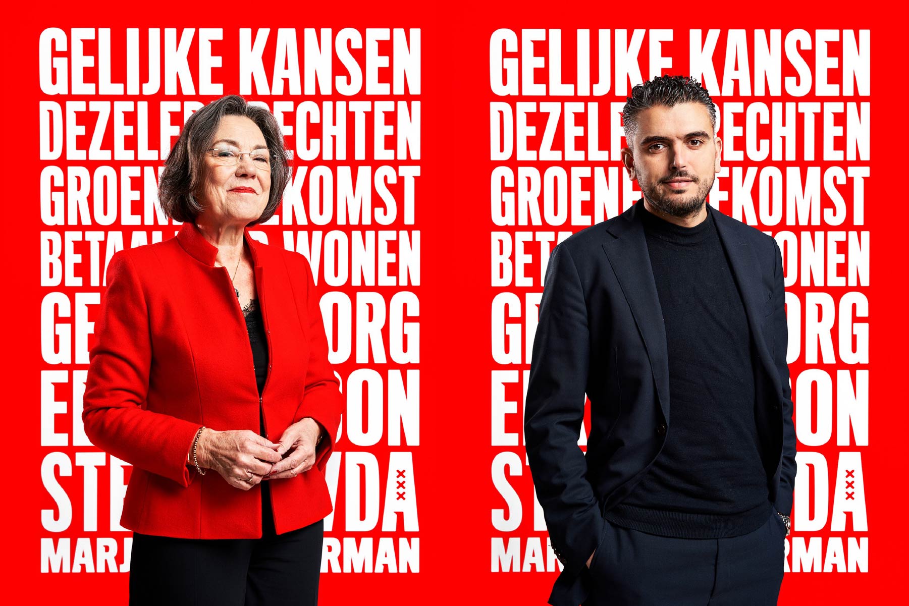
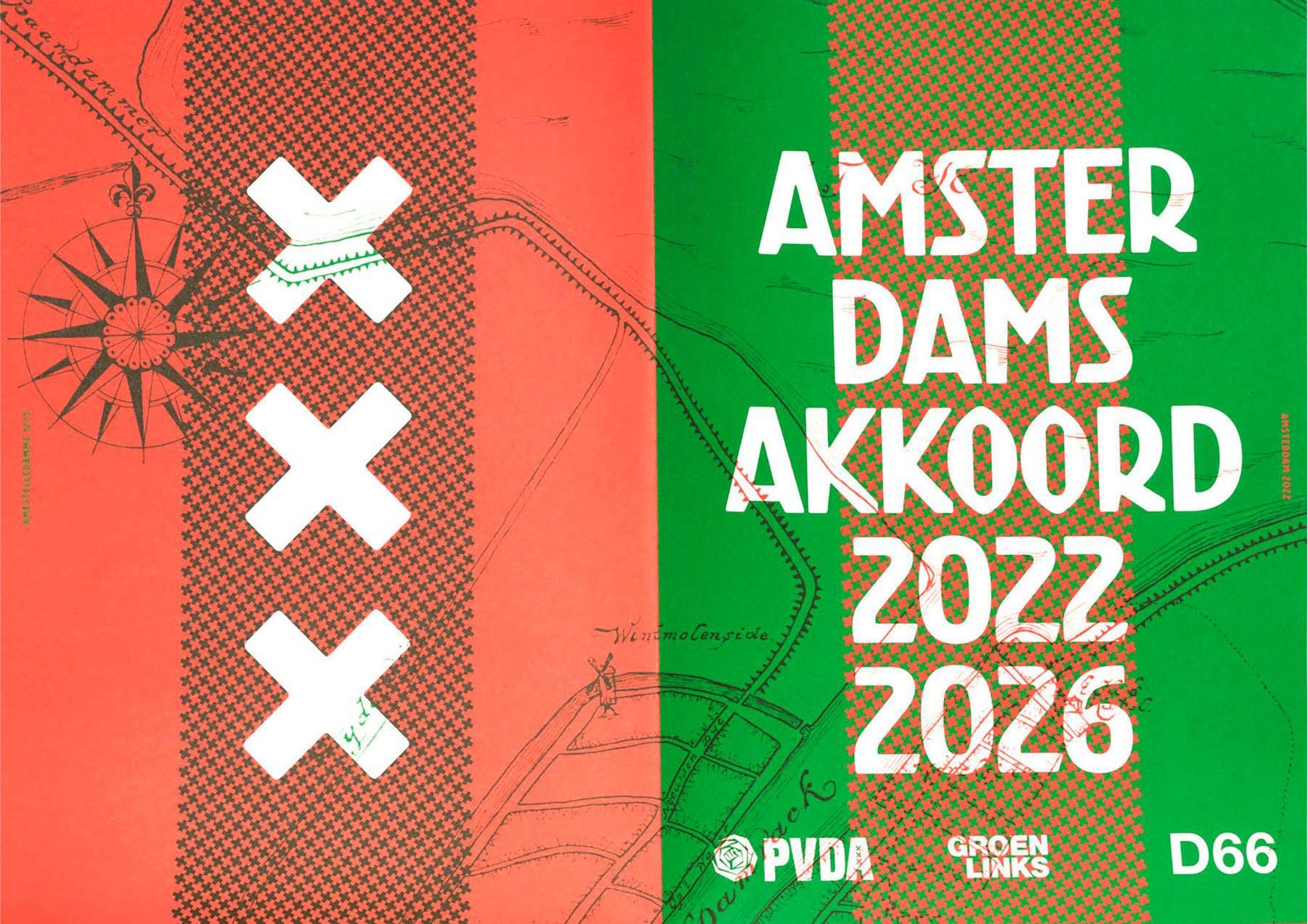
My work for the Amsterdam chapter of the Dutch socialist party PvdA, for example, stems from being raised in what we call a “red nest.” Actually, I hadn’t been voting for PvdA for quite a while when Marjolein Moerman asked me to do their campaign. I replied I’d only do it if she could explain social democracy to my son, who had almost reached voting age. I pointed out that the PvdA’s style guide was essentially identical to that of the social-liberal party D66, except that the color was red rather than green. When she agreed, we designed a bespoke typeface for them and developed a purely typographic campaign. That typeface is still the basis for their campaigns, and also for the upcoming local council elections.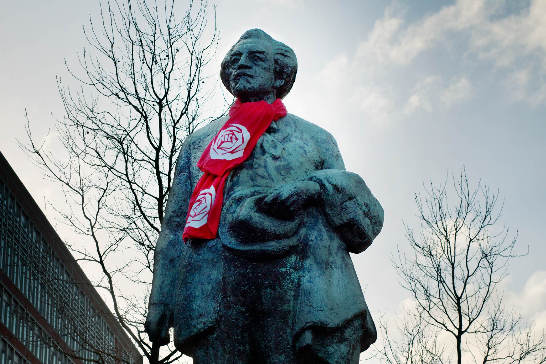
Do you seek out causes like social justice, antiracism, and LGBTQ+ rights to work for, or do they find you?
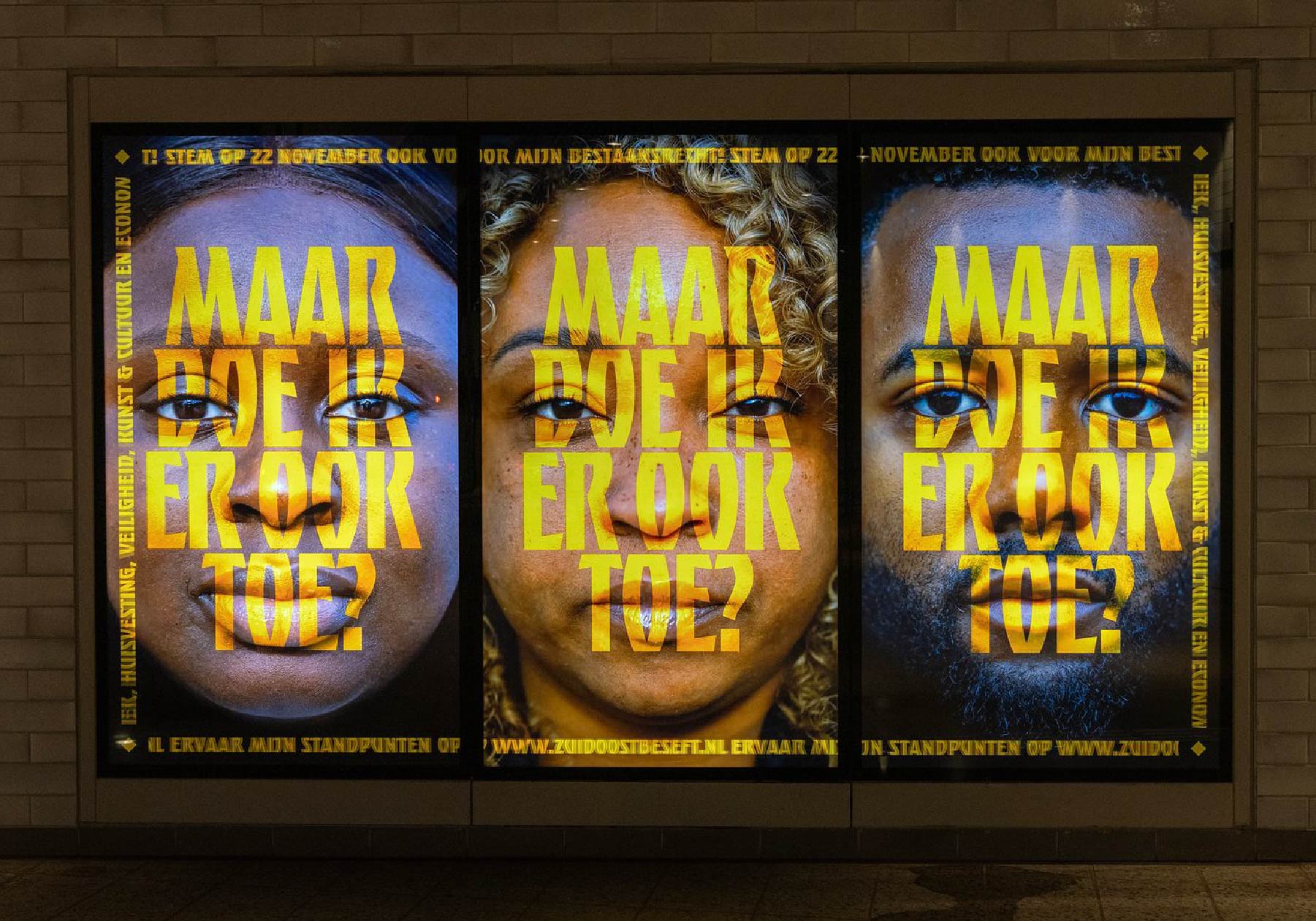
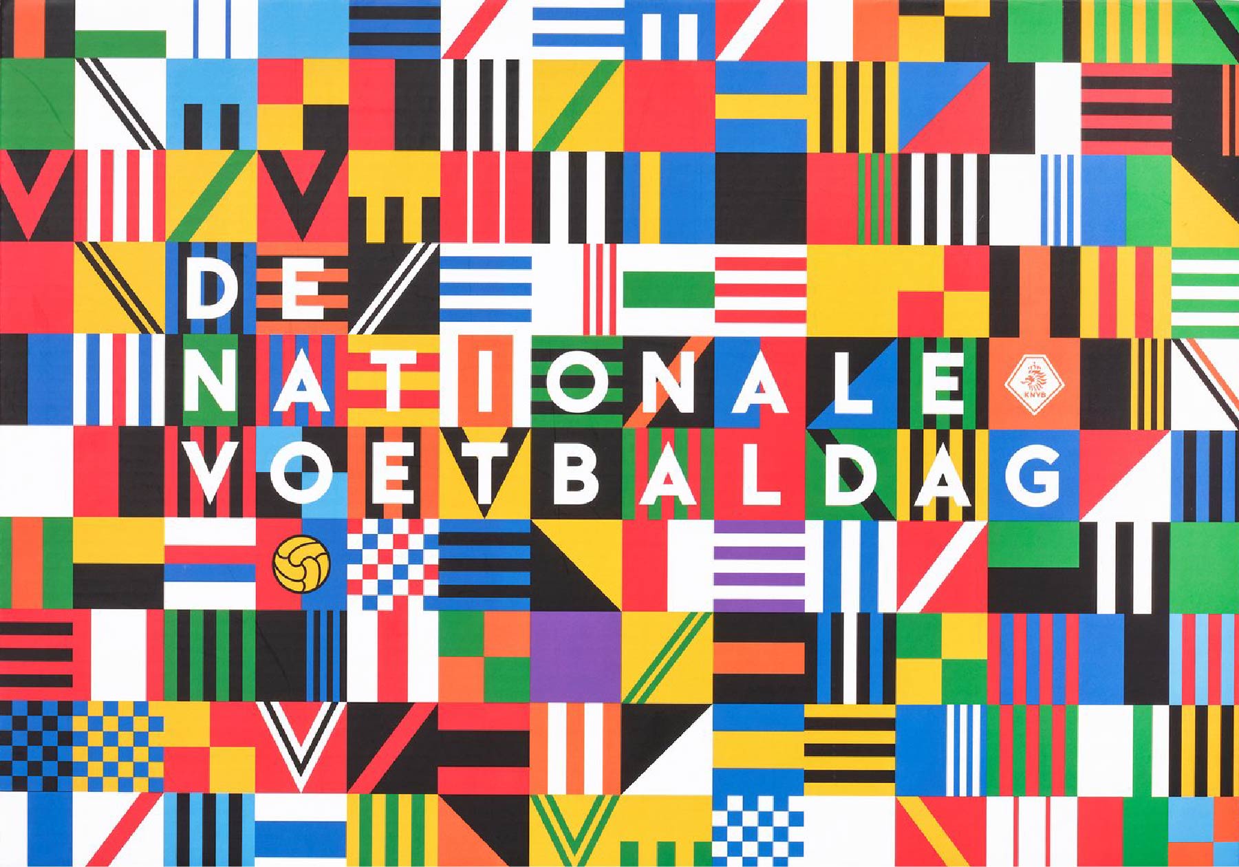
Almost all of these kinds of commissions find their way to us. Our team’s efforts to fight racism have their roots in my upbringing in the Bijlmer (short for Bijlmermeer, a disadvantaged, multicultural neighborhood in southeast Amsterdam – I later designed the Amsterdam Zuidoost borough’s visual identity). Once you are known for specific types of campaigns, you start getting commissions from like-minded people and organizations. That is how the KNVB, the Royal Dutch Football Association, asked us to create OneLove, their antidiscrimination, antiracism, LGBTQ+ rights and human rights campaign, for example. Our ability to transport ourselves, not so much into the mind of the client, but into that of the target group, is the reason we’re so successful. That’s our superpower: having empathy for the people the campaign has to speak to, or simply feeling what the message means.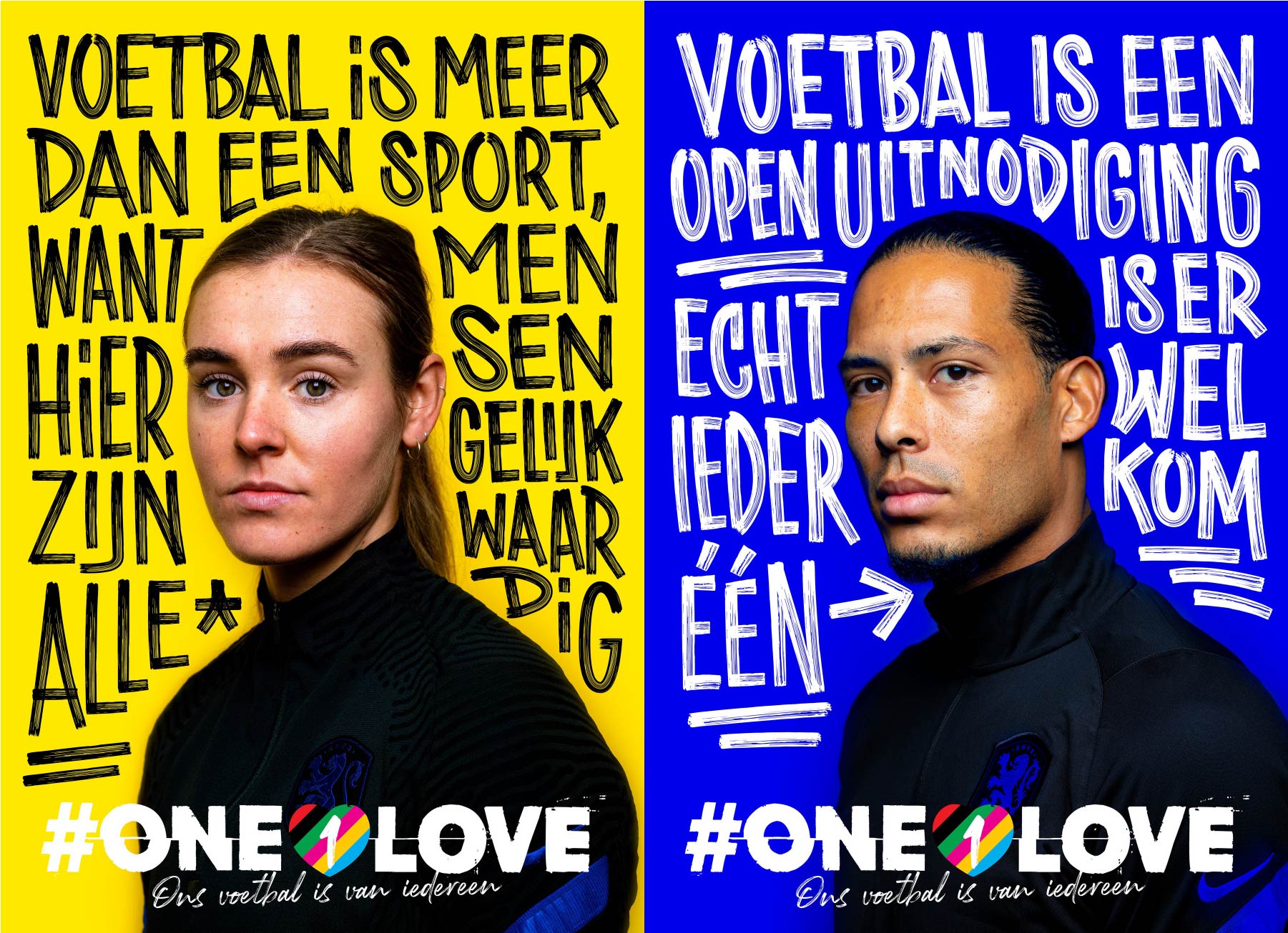
There have been many discussions about whether musicians should speak out on political topics or stick to playing music. Do you think graphic designers have a moral duty to produce political or socially conscious work?
Definitely! As a graffiti artist and poster designer, I realized I possessed the knowledge, skills, and tools to convey messages to the public skillfully and powerfully. That is and always has been the mission of designers. If you have an opinion and hold certain beliefs, you have the means to communicate them.
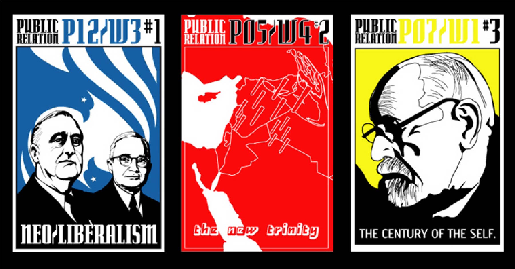
I actually graduated with an editorial project. We created a newsletter called De Bode. [In Dutch, the word bode refers to a person responsible for delivering mail and other administrative documents in an office or company.— Ed.] They were silkscreened pamphlets, folded into envelopes, but also showed up as posters on the streets. We formed our own editorial team, also for Public Relation. That was a silkscreened poster periodical examining politics and neoliberalism, specifically in the US, in the 2000s. We covered 9/11, for example. So, I was doing this before I started as a graphic designer, and I still do. We will be campaigning for a political party again soon. If you can contribute and have both the opportunity and the talent, it becomes an obligation.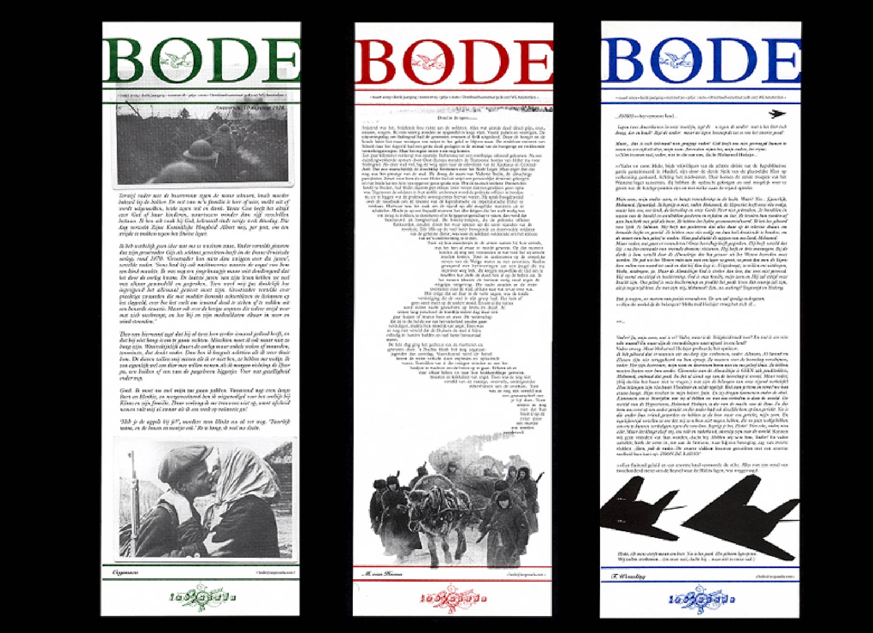
The custom typeface you created for the PvdA is specific to their Amsterdam chapter. It makes me wonder—do you feel typography has a sense of place, a connection with where the letterforms originated and where they exist?
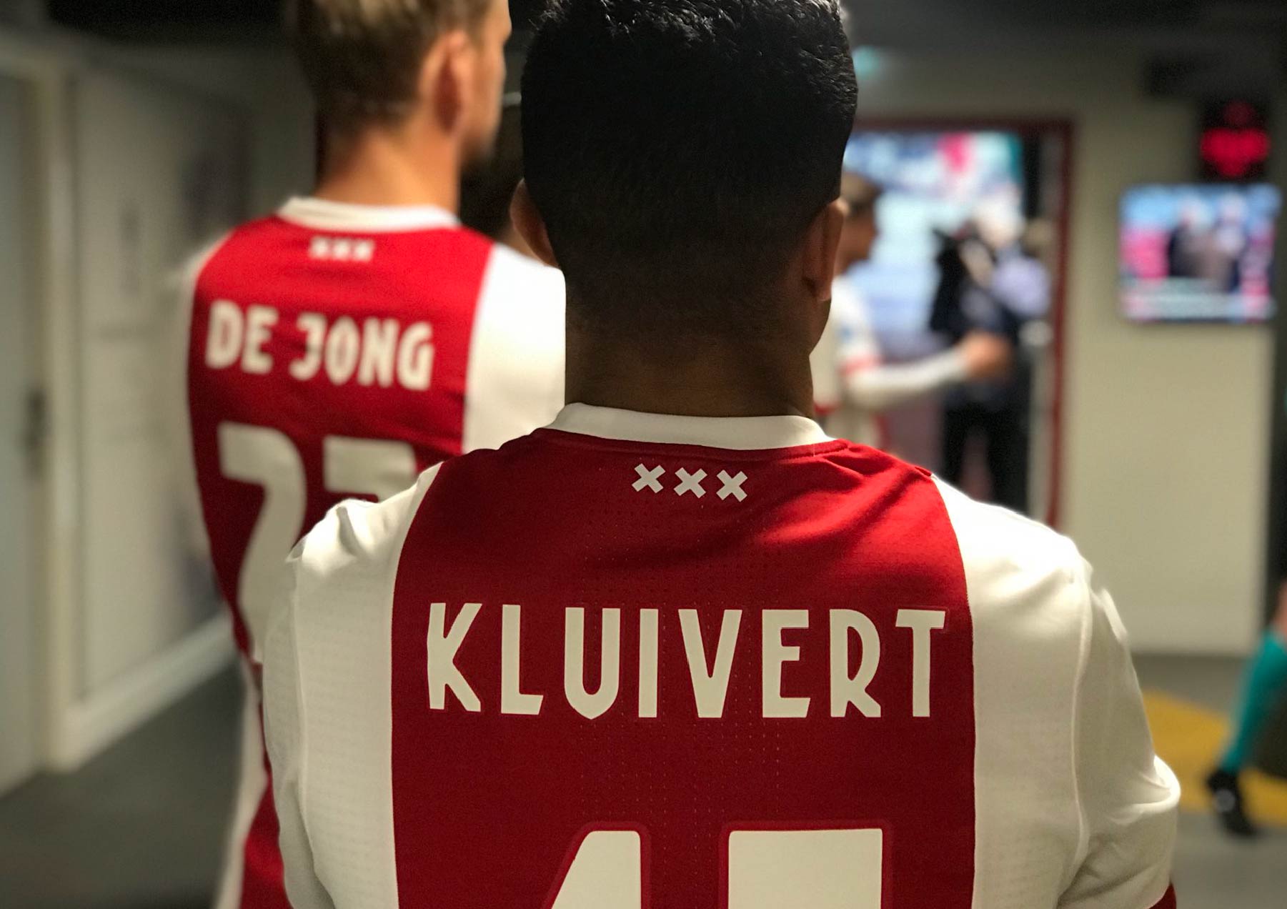
Amsterdam has typical typography, but so do many other cities, like London and Paris. Sure, Amsterdam has the distinct architectural lettering of the Amsterdam School, with H. P. Berlage among others, sort of the aftermath of art deco evolving into a modernist attitude. Take the new Brutal Types collection, for example. As we speak, I am looking at vintage tin pots I bought at a flea market in Delft. They sport the words Koffie, Suiker, and Thee (Coffee, Sugar, and Tea) in the striking lettering that inspired the Keuken font. It made me purchase a license, just for the love of letterforms and the possibility of using it in the future. It’s really lovely that type designers turn these unusual letters into usable typefaces. After this interview, I am leaving to check proofs for the book Kado van de stad, published by the city of Amsterdam. We used VLNL Berlagebrug Gietijzer for that one. Top-tier soccer team Ajax did a good job by using Kurversbrug, a quintessential Amsterdam typeface, for their squad numbers. So, yeah, it helps with imbuing typography with a sense of place.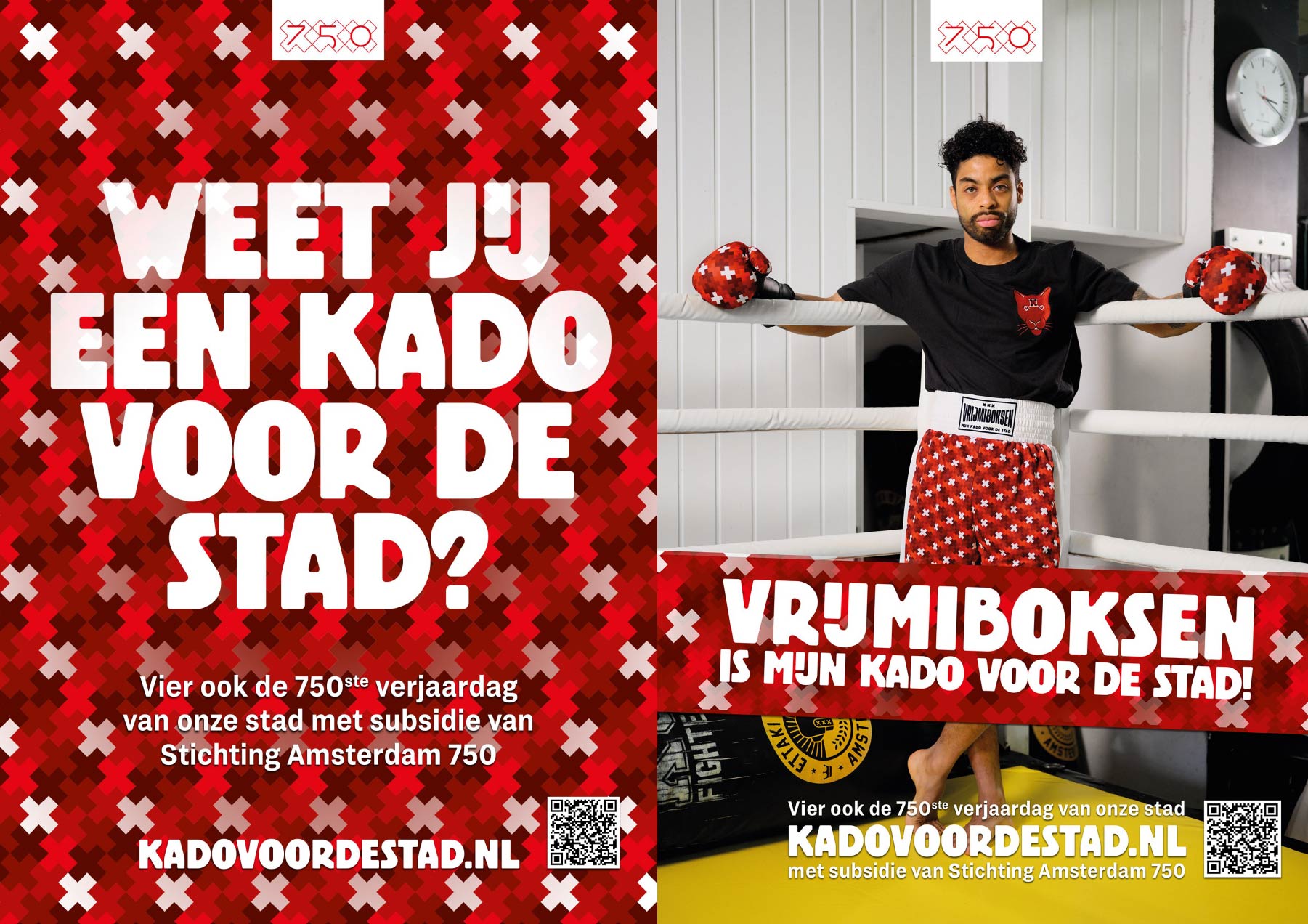
One time, we developed a campaign called Gappie for the VCA [Vrijwilligers Centrale Amsterdam, or Amsterdam Volunteer Center—Ed.] to recruit buddies for lonely people. They receive a visit from a “gappie” (slang for “buddy”) once a week. It’s a purely typographic campaign designed with Kurversbrug. It appealed to many more people than its specific target group, and really resonated because the typeface is so uniquely Amsterdam. Even if you don’t know anything about typography, it is immediately recognizable on a subconscious level because it’s so ubiquitous in the city.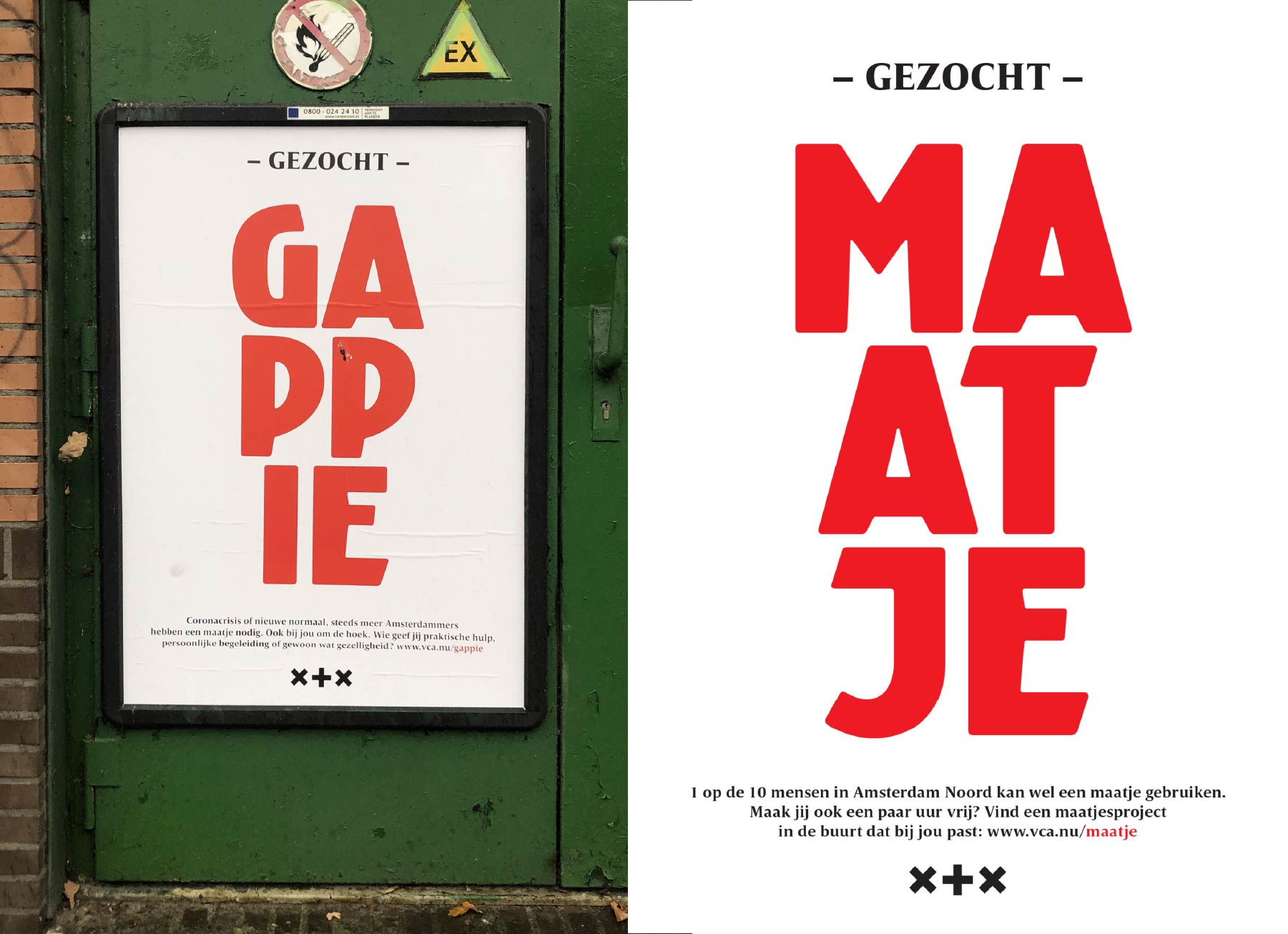
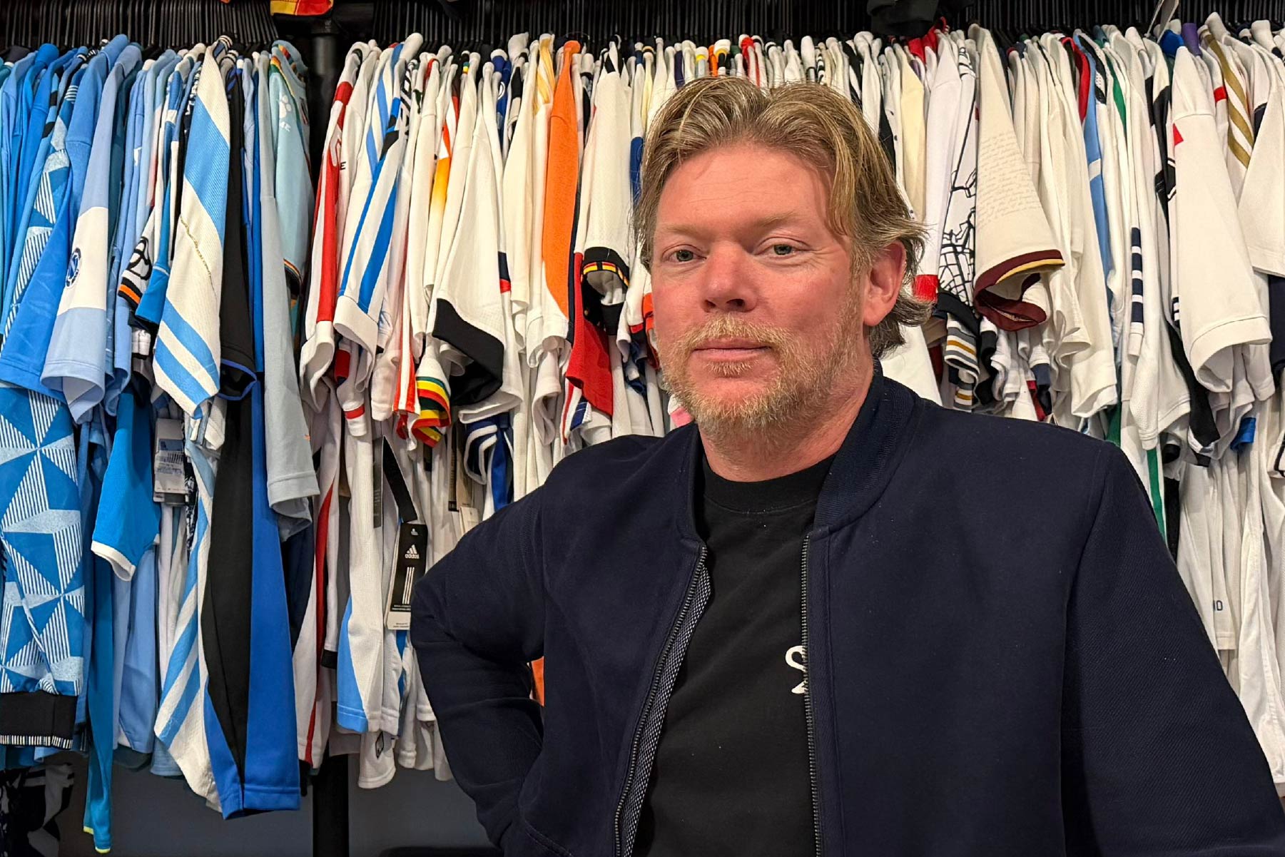
I’d like to focus on your Blood In Blood Out project. What is it, exactly?
Blood In Blood Out is our soccer jersey brand. We play with identity by creating mashups of different teams’ shirts, just like we often combine disparate iconographies in our graphic design work. By mixing identities and cultures, we produce new images, new bloodlines. This project has its roots in a heraldry course I took at the Rietveld Academie. The most interesting part of genealogy’s visual language is the family trees themselves. If a red sir married a blue lady, their firstborn received a coat of arms that was half red, half blue, and so on and so on. The most honest heraldry can be found in Spain, for example, where these keep recombining. Northern European countries prefer to keep their coats of arms pure. That’s why the nobility often married within their family, with all the consequences that entails, just to keep the heraldry “clean” – unbelievable. During the period that I was wheat-pasting in the streets, I started putting up genealogy posters. While they looked nice as decor or wallpaper, they didn’t serve a goal; they were too personal and vague.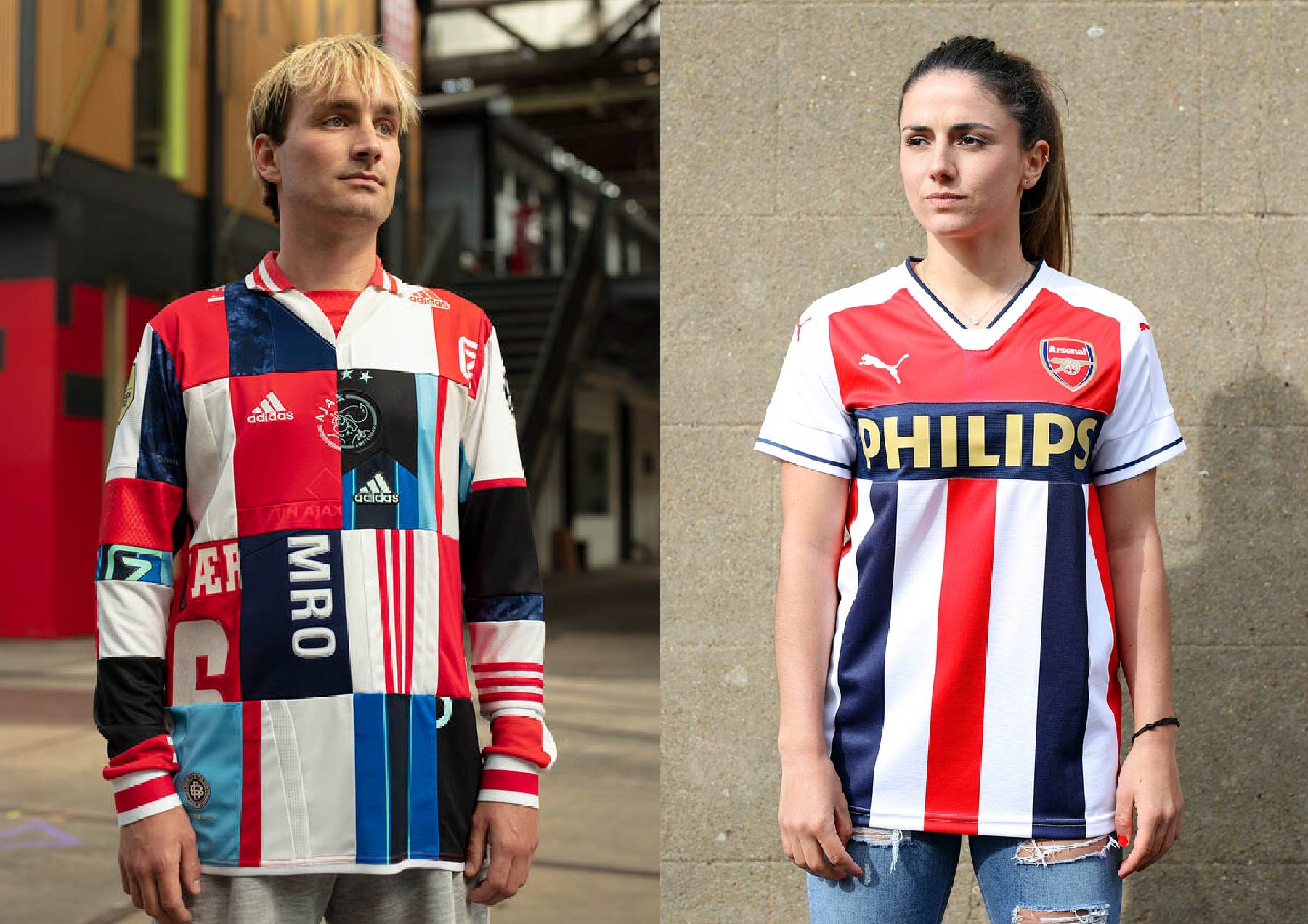
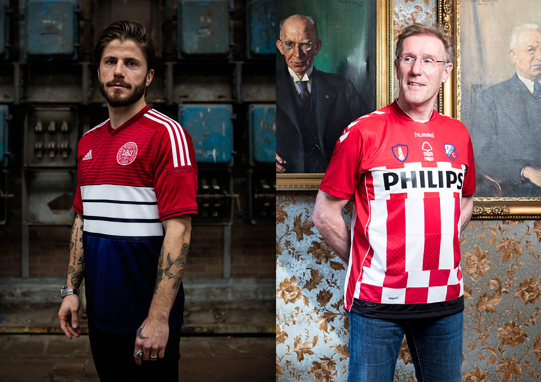
During the 2004 European Championship, due to a convergence of circumstances, I came up with the idea of cutting up soccer jerseys and mixing them. I started showing them in solo or group exhibitions to tell the story of heraldry, combining low culture with high culture by bringing the shirts into museums, galleries, churches, and so on. They became wearable flags, an army of the now. If you sew Feyenoord and Ajax together, you get war. But it’s also a way to express brotherhood. We collaborated with models and soccer teams and eventually published a book. We made every single mashup we could think of, not just rivalries but also marriages. Combine the Netherlands, Germany, and Argentina, for example, and you have the current royal family of the Netherlands.
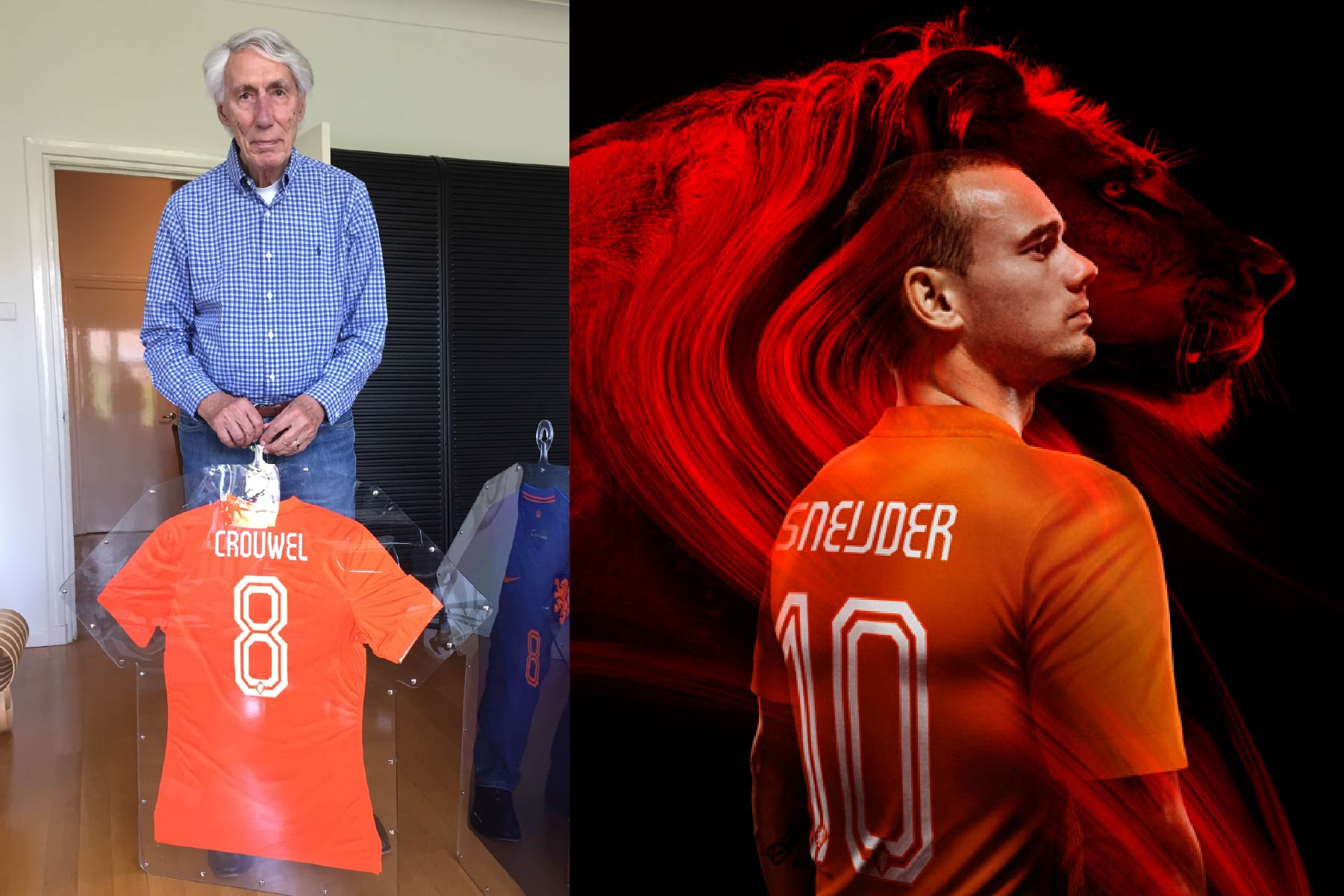
When the book came out, Nike commissioned us to design actual soccer jerseys – for the Dutch national team, obviously, but also for other countries like Brazil, England, Portugal, Türkiye, and so on. After doing this for a few years – I was teaching in The Hague – I ran into Wim Crouwel. He agreed to design the typeface for the names and numbers on the Dutch squad’s jerseys.
At one of the exhibitions, a kid asked me if I could do Greece and Portugal. He explained: “Those are my parents, so I’ll never have to choose between them anymore.” That was when the name Blood In Blood Out came into its own; it was literally his blood. The project stopped being art and became a brand. We regularly make jerseys for people who want to express their heritage, career, bloodline, or commemorate a special soccer game. In a moment, the Algerian ambassador is picking up his shirt combining the Netherlands and Algeria. There’s a whole story behind that jersey, about a KNVB coaching project in Algeria and Johan Neeskens, who sadly passed away there last year.
To circle back to our activism, you can also tell a story about mixing cultures with a simple logo. Our OneLove heart is often misinterpreted. It’s not the LGBTQIA+ rainbow: it’s a combination of the red, black, and green Pan-African flag; and the blue, yellow, and pink pansexual flag. Playing with codes and conveying meaning with simple iconography is the essence of heraldry.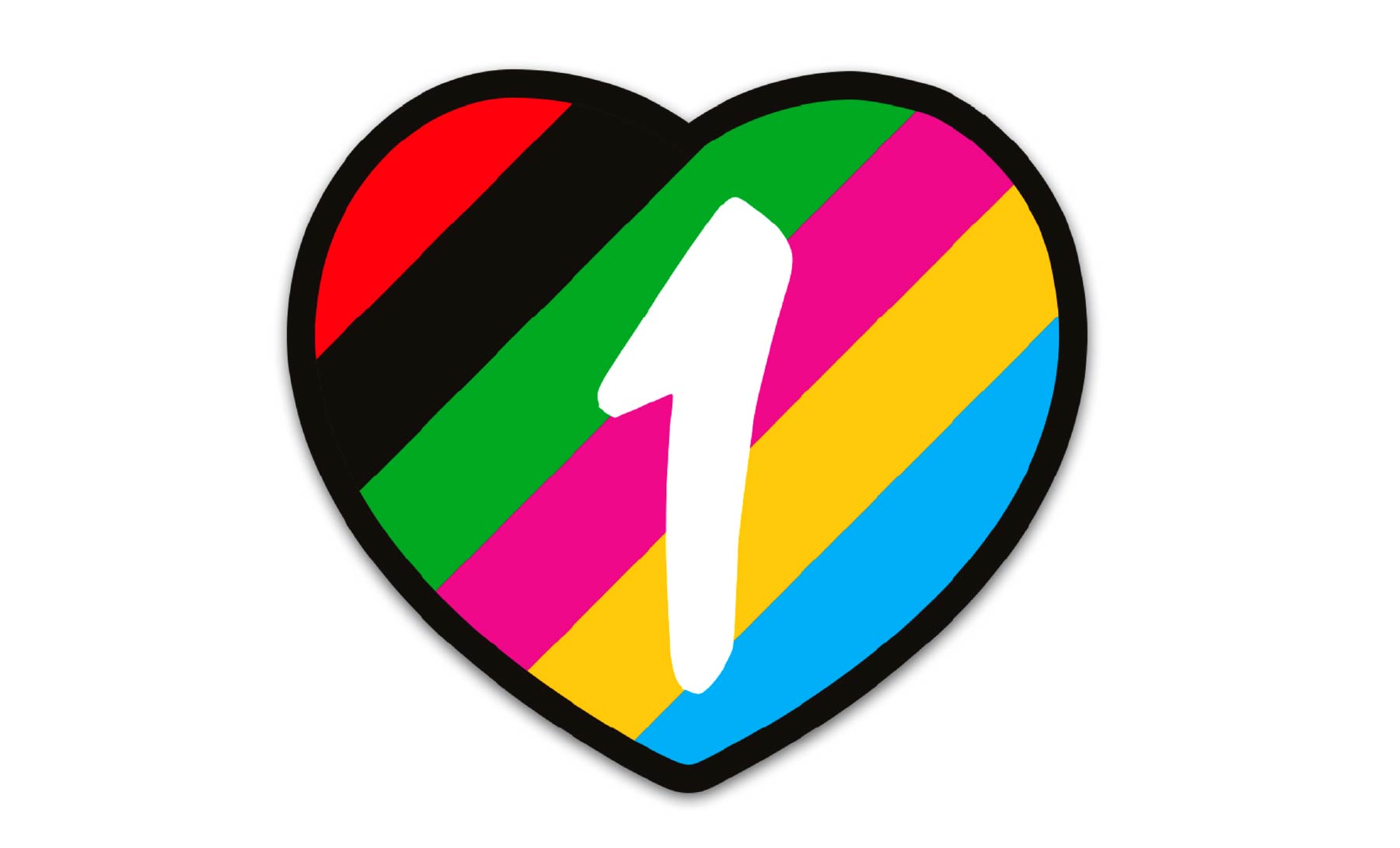
To wrap up, what advice would you give to students starting out in graphic design?
McDonald’s and Coca-Cola released ads entirely generated by AI. It caused such a backlash that McDonald’s had to pull its ad. Nevertheless, it was praised to the skies in a recent interview in an advertising magazine. Unfortunately, this kind of AI slop will shape the future of design. I hope it won’t, but still. My nineteen-year-old son, for example, refuses to use AI. He is also upset if he notices we have applied it in our work. That’s to his credit, and it gives me hope for the future, hope for human creativity. The most important thing is to tell an authentic, engaging story, and that is something uniquely human.
Interview: Yves Peters
Edition: Caren Litherland