A custom Sans for G-Star

Another project we led involved the design of a custom type family in four variants for the denim fashion company G-Star, closely based on the geometry and proportions of the brand’s logo. The goal was to create a modular sans serif that could extend the visual language of the identity beyond the logo and into the brand’s broader communication system.
Working from the structural logic of the existing wordmark, we developed a geometric alphabet that preserves the directness and clarity associated with G-Star’s visual presence. Particular attention was given to consistency, spacing, and adaptability, ensuring the typeface could perform across a wide range of applications while remaining clearly aligned with the brand.
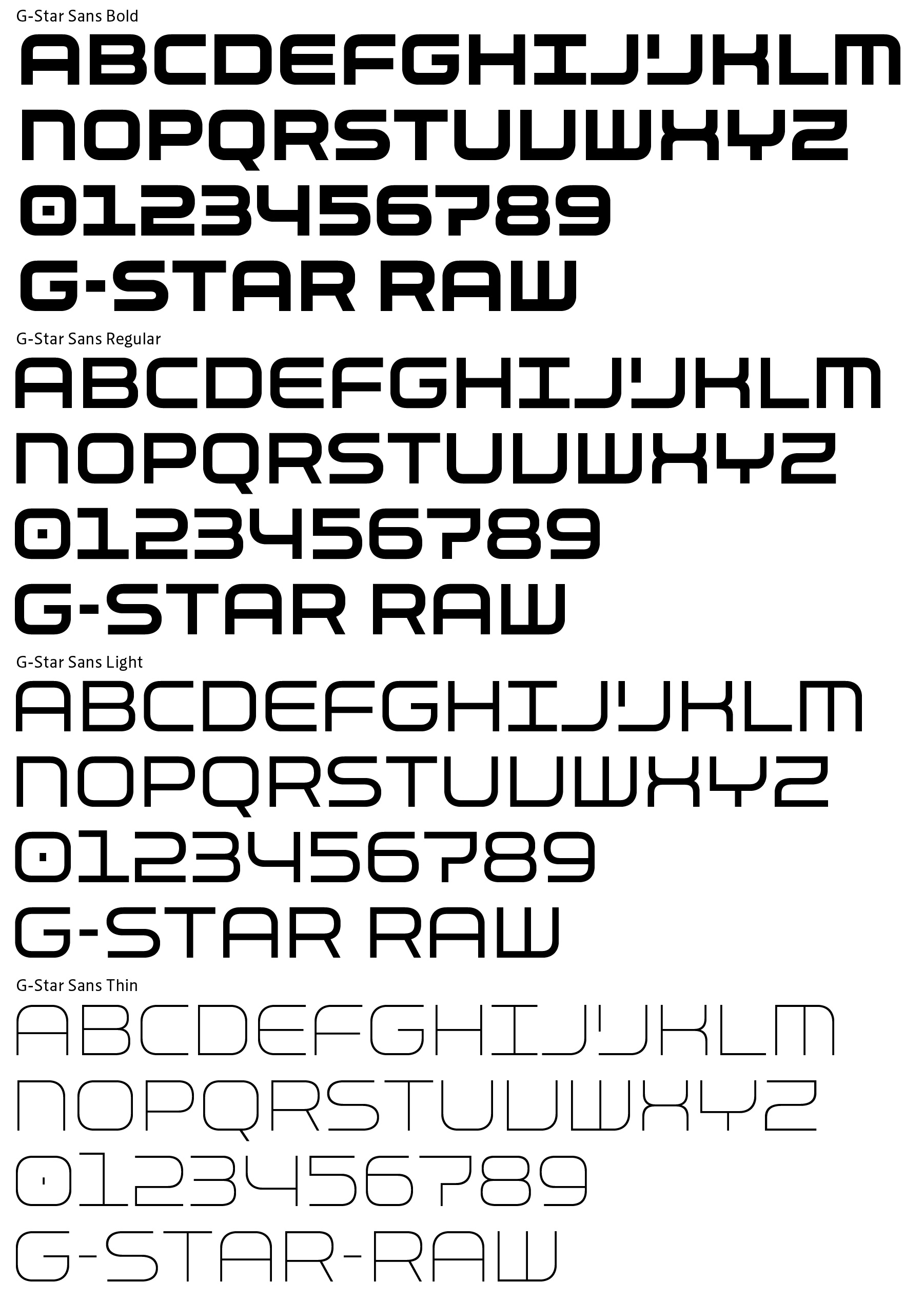
The resulting custom fonts were designed for use in store graphics and architectural decoration, as well as in collateral materials, promotional publications, and other branded communications. Its modular construction and geometric forms make it highly effective in large-scale environments, where clarity and strong recognition are essential.
This project highlights the value of bespoke typography in strengthening brand identity, allowing a logo’s formal DNA to evolve into a complete typographic system that supports communication across physical and printed spaces.