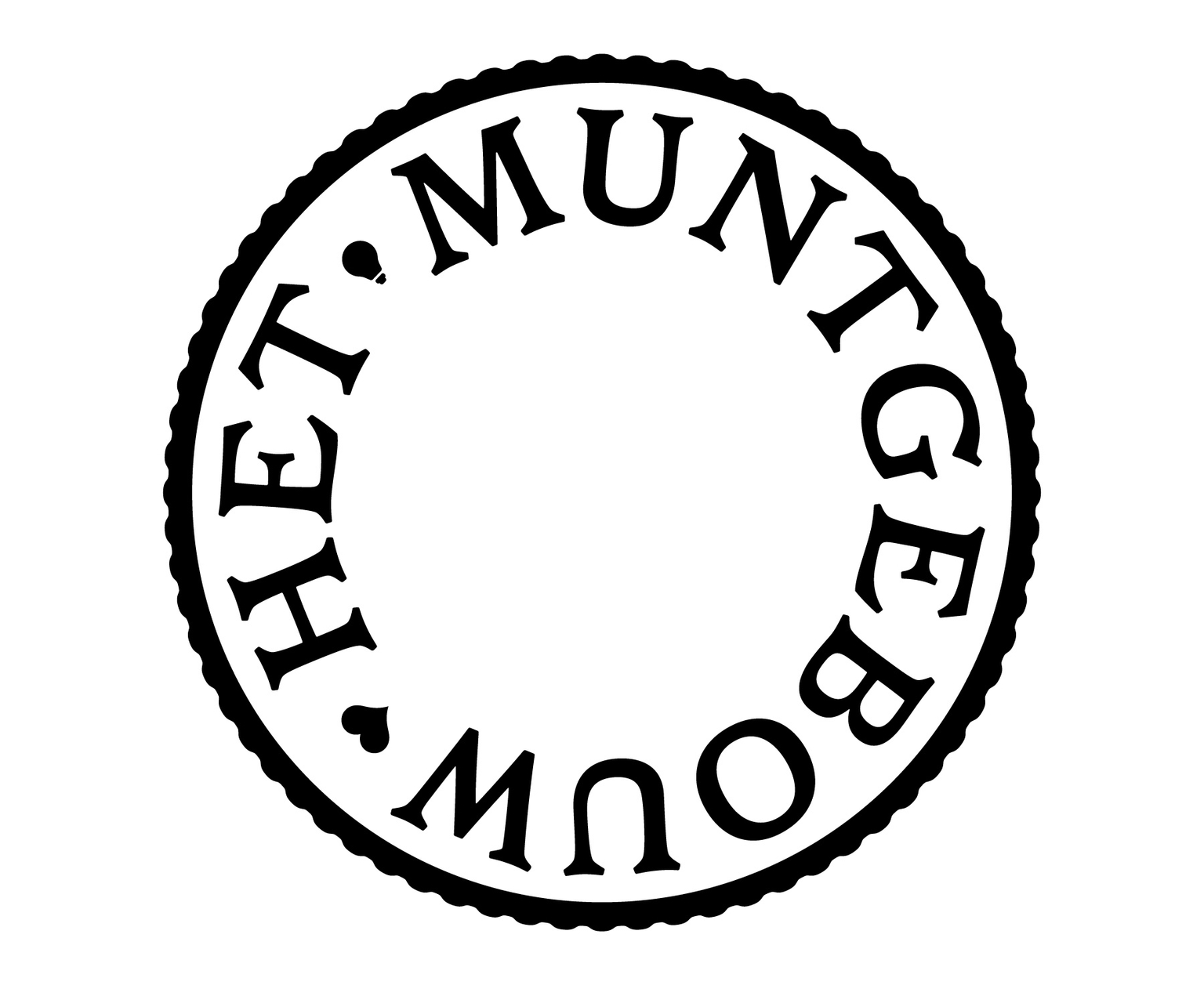
During the year 2025, we collaborated with The Stone Twins on the visual identity for Het Muntgebouw, the former Royal Dutch Mint in Utrecht, now transformed into a mixed-use cultural and business space. At the core of this project was the development of a bespoke typographic system, designed by Ramiro Espinoza, intended to connect the building’s new identity with its historical function.
The identity’s logo has since been recognized with a Gold Medal in the Brand Logo category at the European Design Awards.
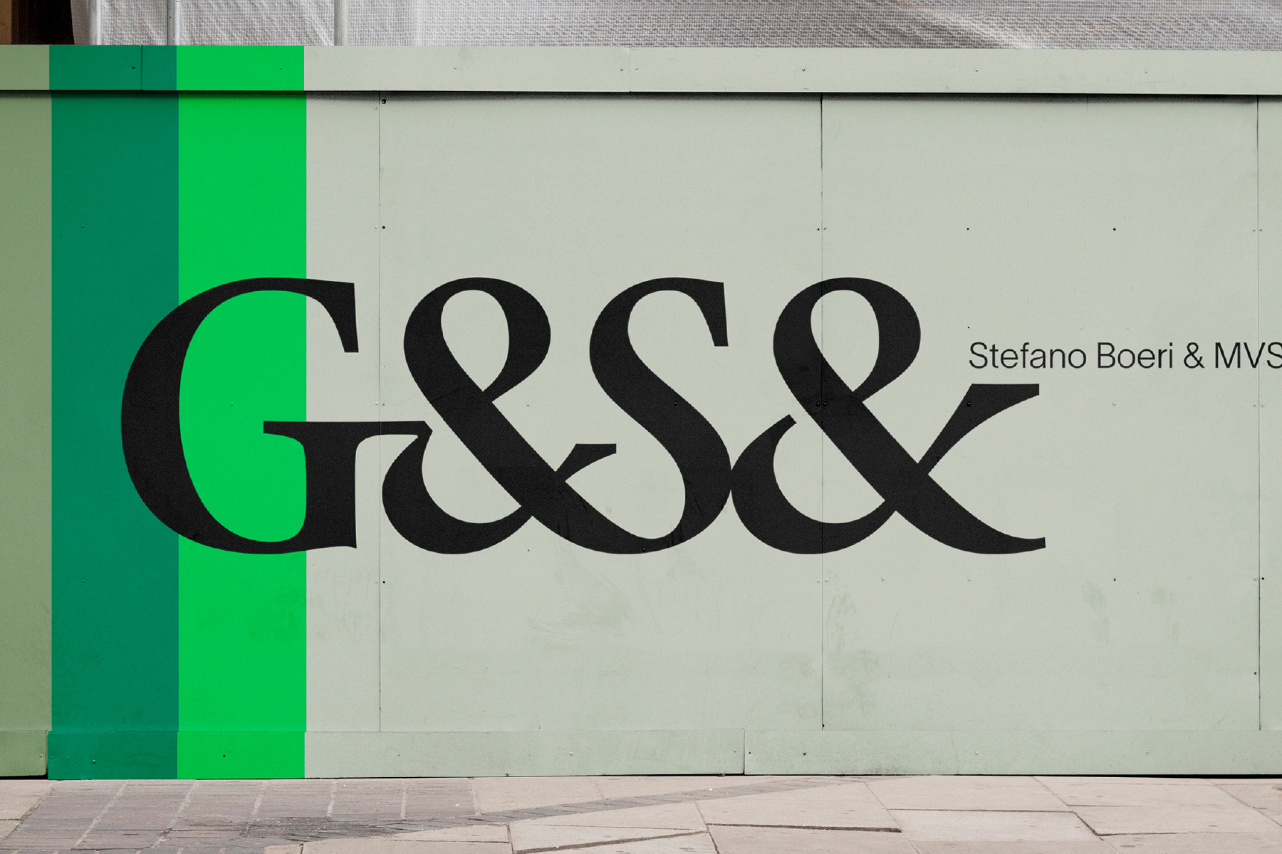
At the end of 2022, Retype got a call from the brand consultancy The Stone Twins, with whom we had successfully collaborated in the past. Declan and Garech had exciting news: they had been tapped to revamp the corporate image of G&S Vastgoed, one of the leading real estate developers in the Netherlands.
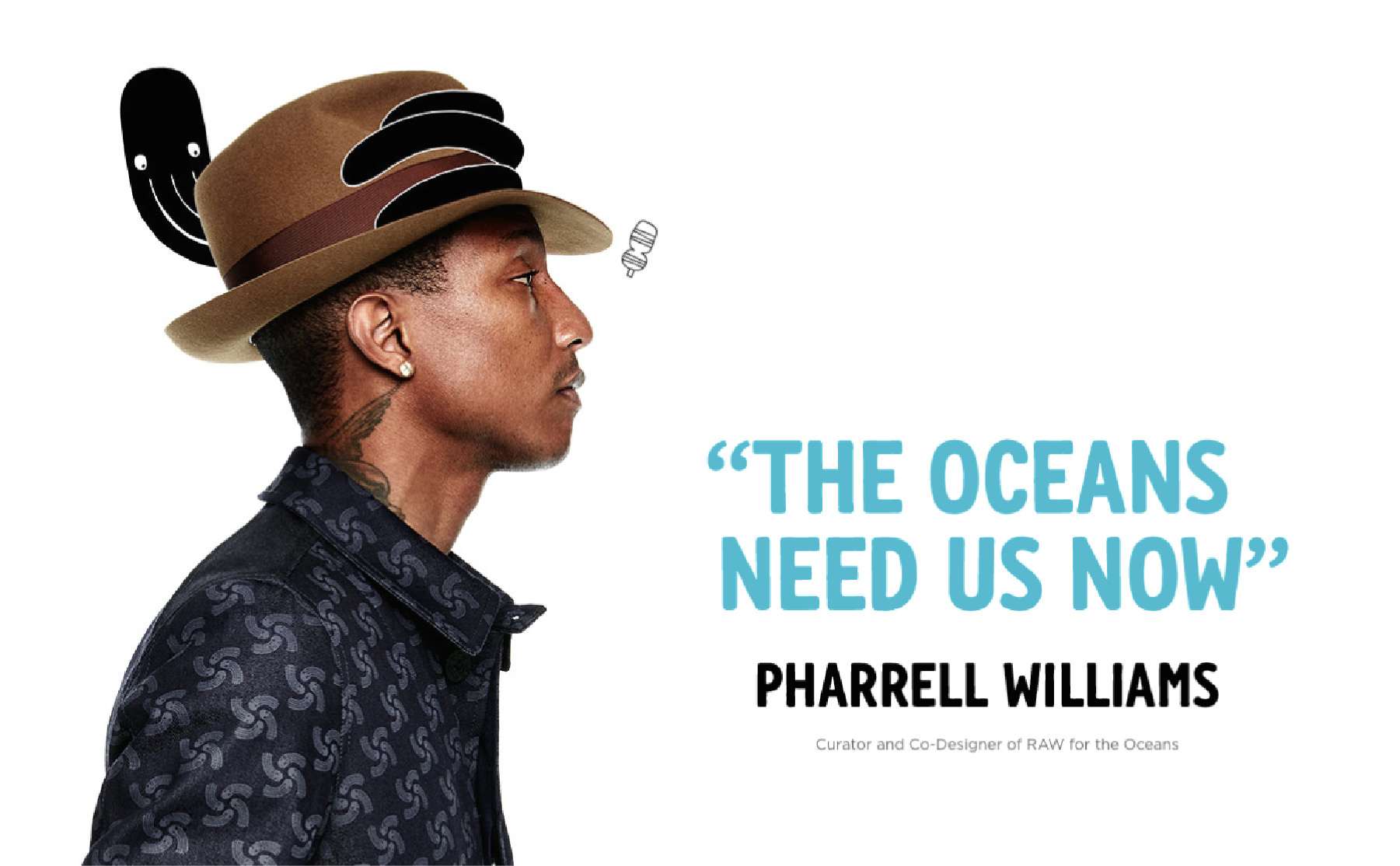
A few years ago, we were commissioned by the denim fashion company G-Star to develop a custom typeface for their campaign Raw for the Oceans. This initiative introduced an innovative fabric made from recycled plastic recovered from the sea, later used in the production of G-Star’s denim garments.
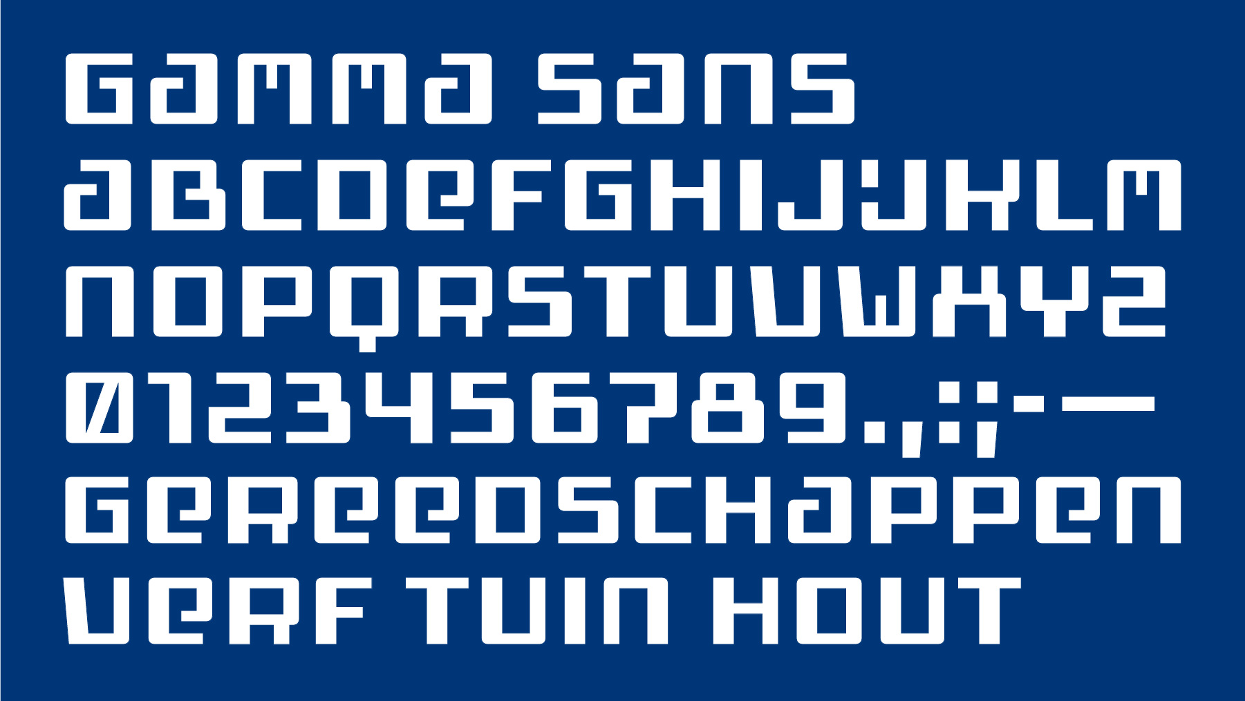
We developed the GAMMA Sans typeface family to support and expand the visual identity of one of the Netherlands’ leading home improvement and construction retailers. The starting point for the project was the company’s well-known logo, characterized by its modular structure and strongly geometric letterforms.

Another project we led involved the design of a custom type family in four variants for the denim fashion company G-Star, closely based on the geometry and proportions of the brand’s logo. The goal was to create a modular sans serif that could extend the visual language of the identity beyond the logo and into the brand’s broader communication system.