GAMMA Sans: Extending a Brand Identity
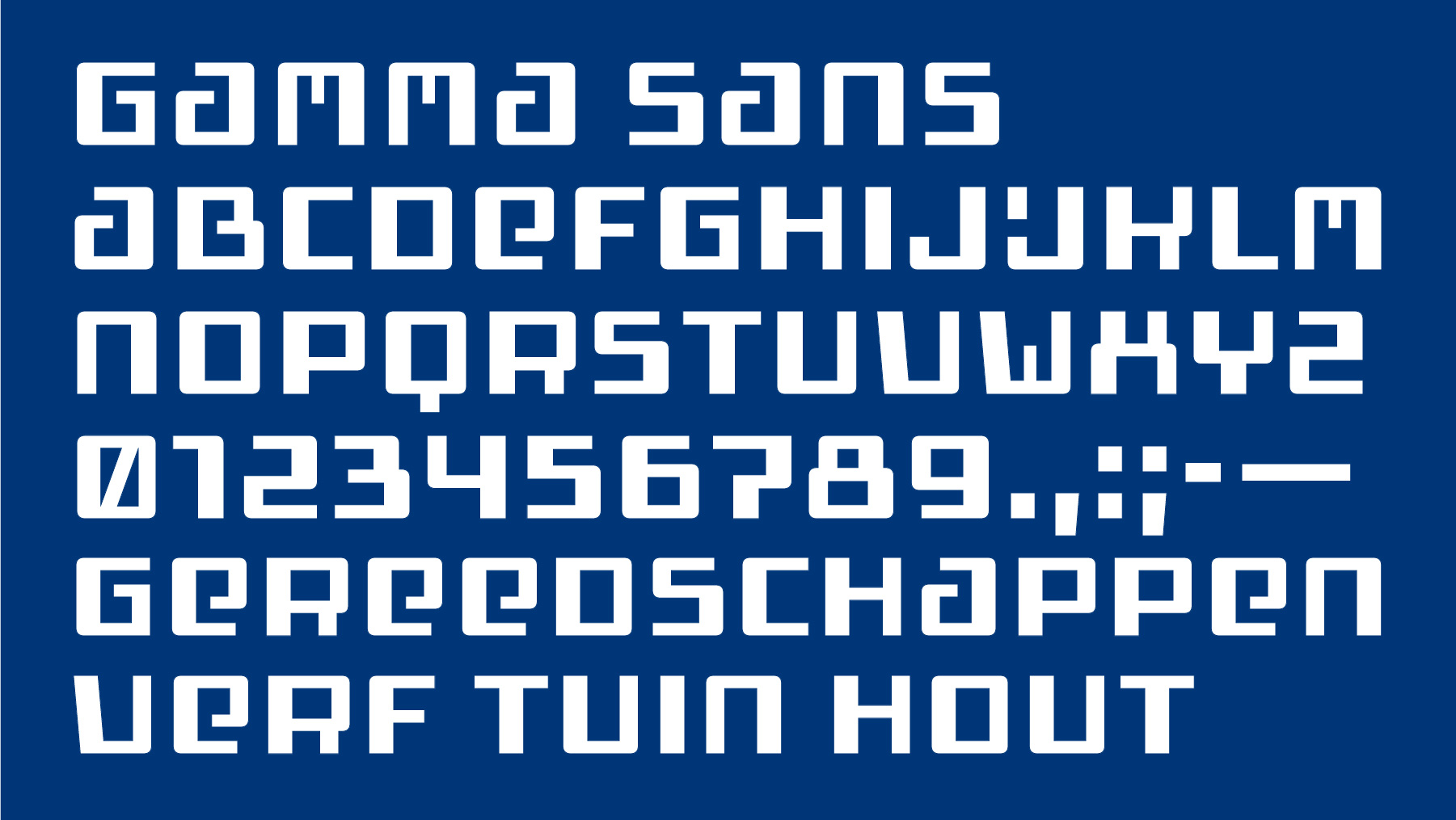
We developed the GAMMA Sans typeface family to support and expand the visual identity of one of the Netherlands’ leading home improvement and construction retailers. The starting point for the project was the company’s well-known logo, characterized by its modular structure and strongly geometric letterforms.
These forms relate to a broader tradition of architectural lettering, commonly seen in early twentieth-century signage, façades, and advertising. By building on this visual language, we aimed to create a typeface that would feel consistent with the brand while offering greater flexibility across different applications.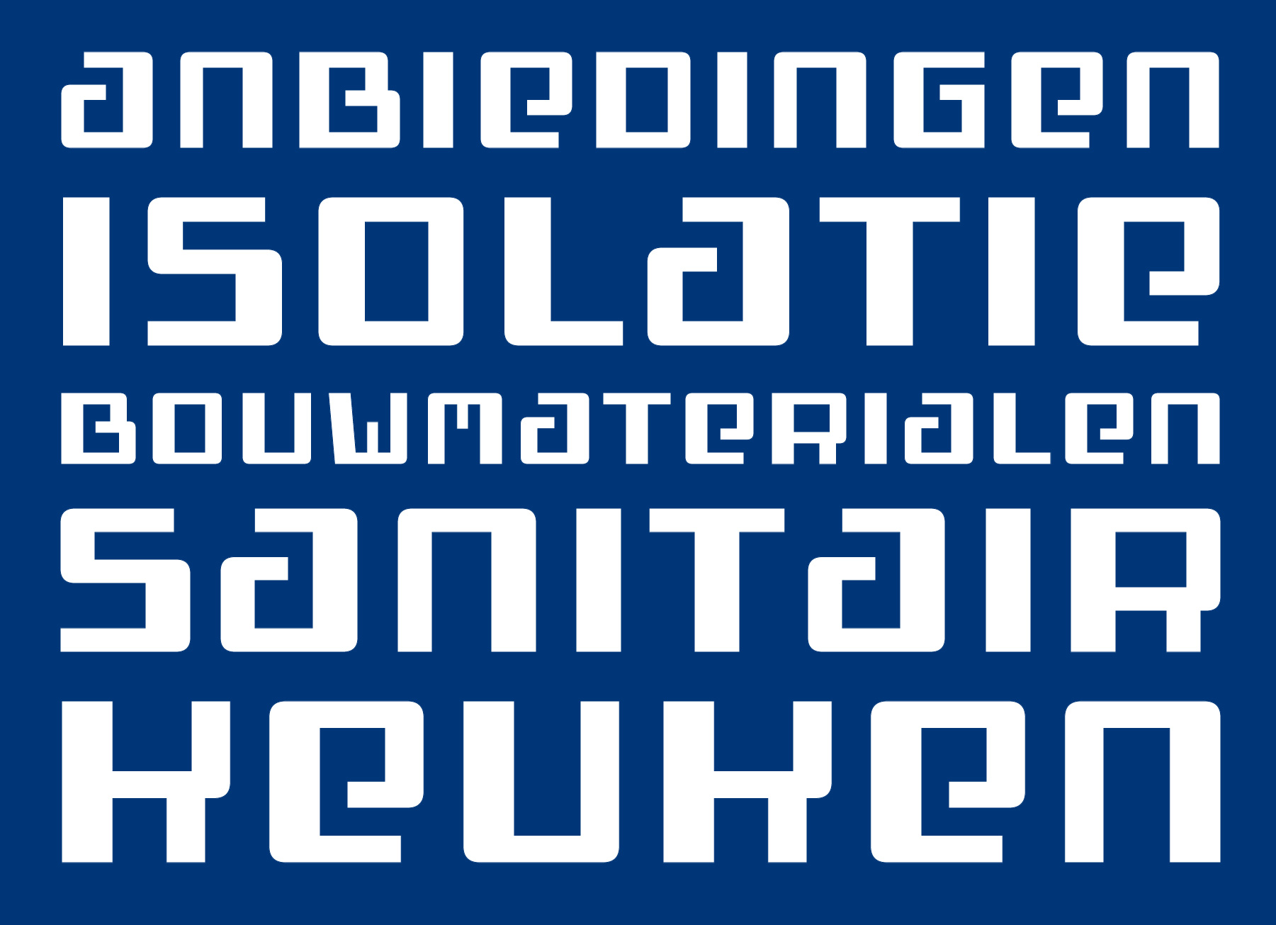
Drawing on our experience at Brutal Types with modular and historically informed letterforms, we translated the logic of the logo into a coherent typographic system. The resulting family maintains the structural qualities of the original mark while introducing the characters needed for everyday use.
GAMMA Sans was designed for implementation across store environments, printed materials, and digital communication. The project demonstrates how a custom typeface can extend a brand’s visual language, turning a single logo into a complete and adaptable system for communication.