Designing the Gashouder Typeface
We recently collaborated with Gashouder BV, part of the Amsterdam-based Westergas group, to design a custom typeface for its visual identity and communications.
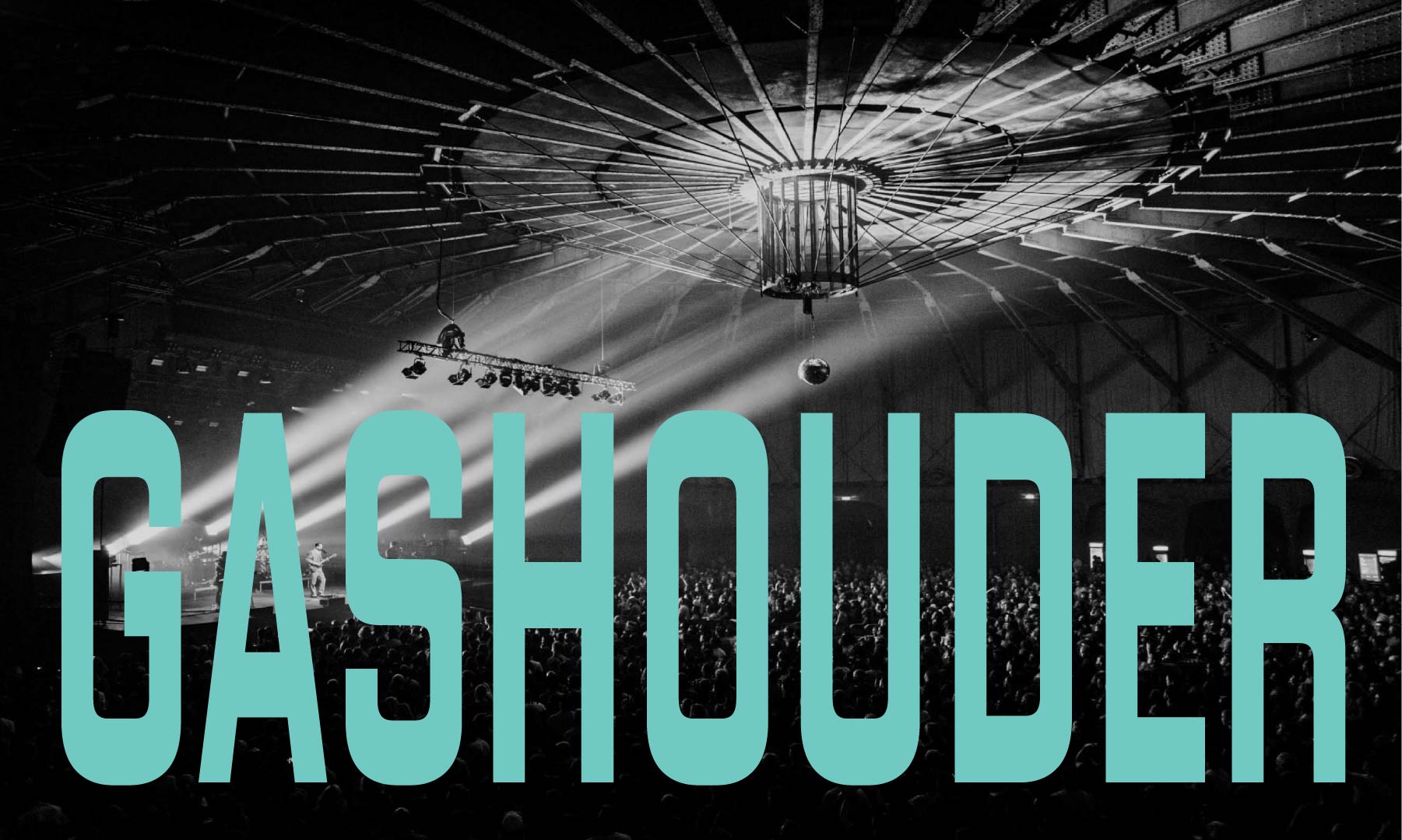
Gashouder is a large industrial space transformed into a venue for artistic and musical events, with a capacity beyond what the clubs in Amsterdam’s city centre can offer.
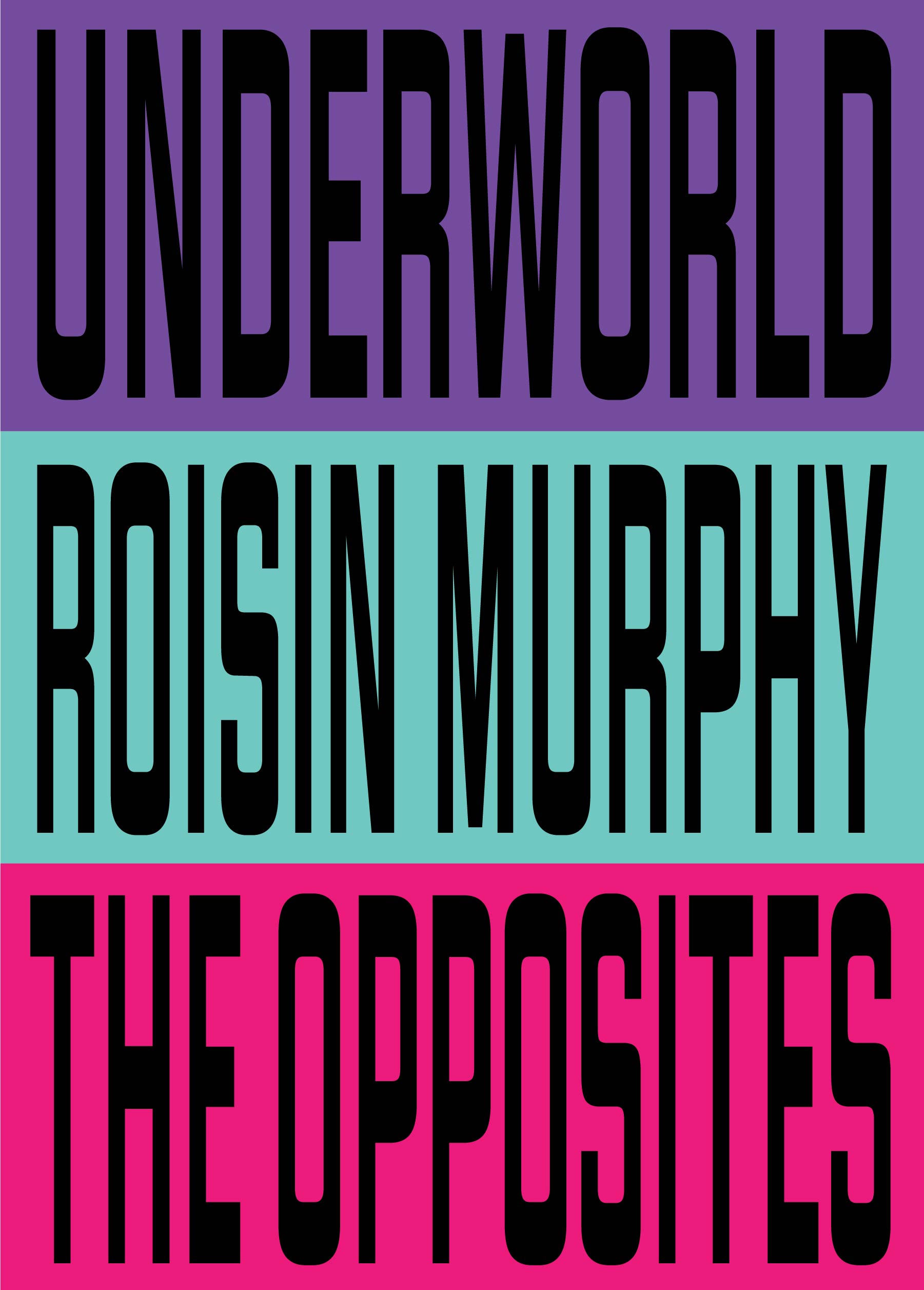
Under the art direction of Mercedes Coco Huis and Ruud de Bruin, and with the graphic design by Leona Refugia, it was decided that Gashouder would forgo a conventional static logo. Instead, its identity would be built around a custom typeface family that effectively serves as the logo itself, with the type deployed across varying degrees of condensation and expansion, complemented by a distinctive colour palette.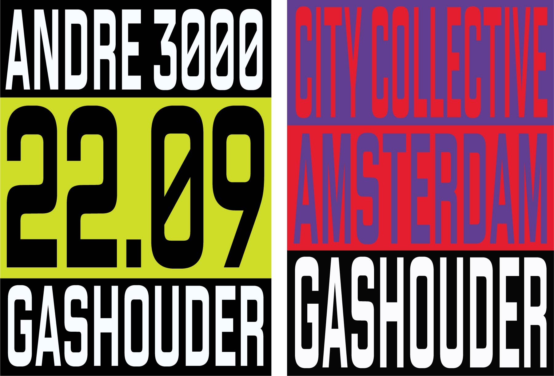
The variations in proportion and contrast are intended to evoke the aesthetics of 1980s club flyers and the techniques of early computer-aided design, when newly available digital tools were often used to manipulate type. In contrast to established typographic practices, these techniques could radically transform the appearance of existing typefaces, resulting in a distinctly postmodern visual language.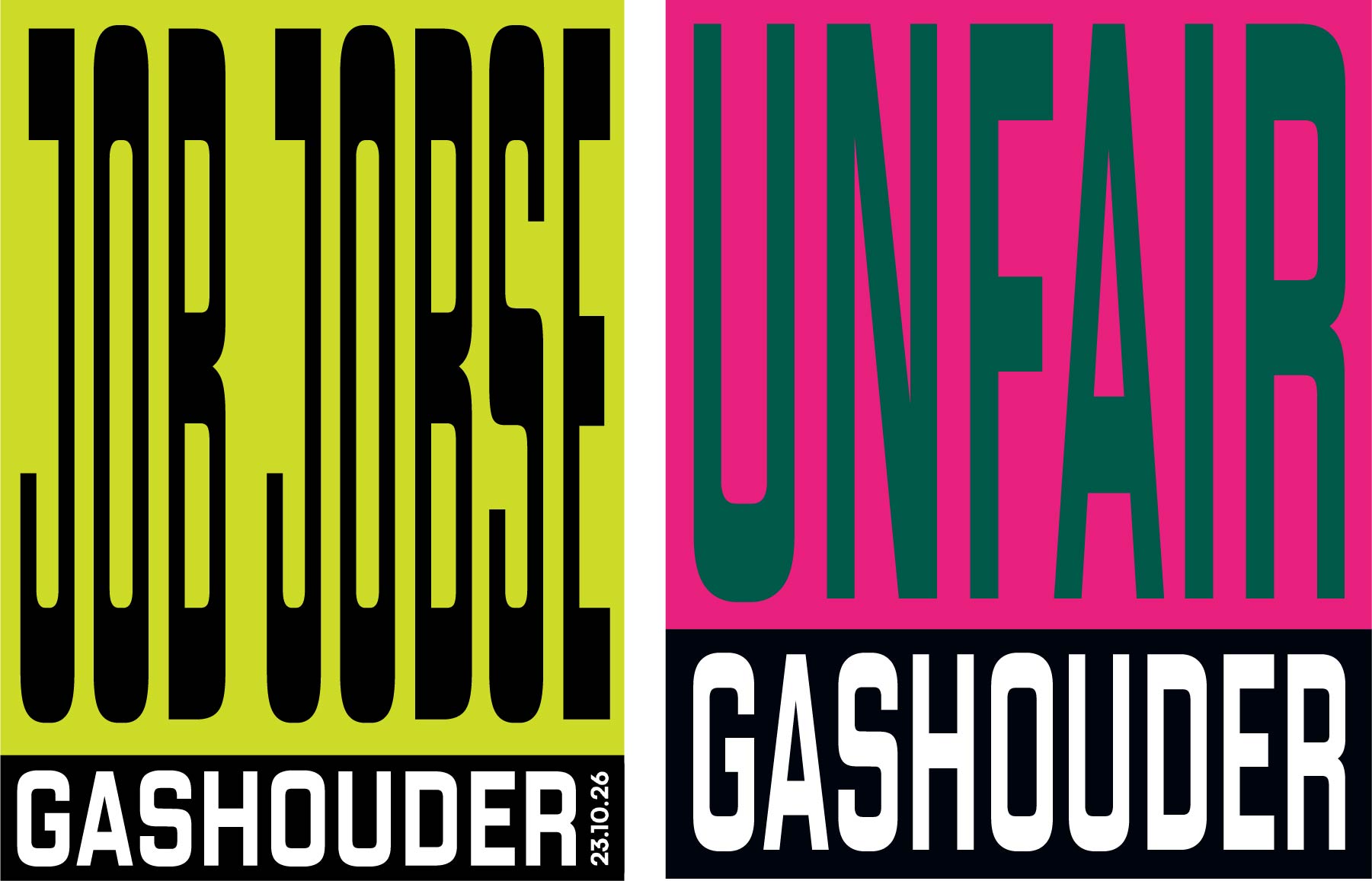
To avoid the extreme distortion and awkward spacing that can result from artificially compressing or expanding a single font, our proposal was to create a variable typeface family that could reproduce the desired effect while resolving most of the typographic problems associated with such transformations. The result strikes a balance between deliberately breaking the rules and maintaining typographic precision.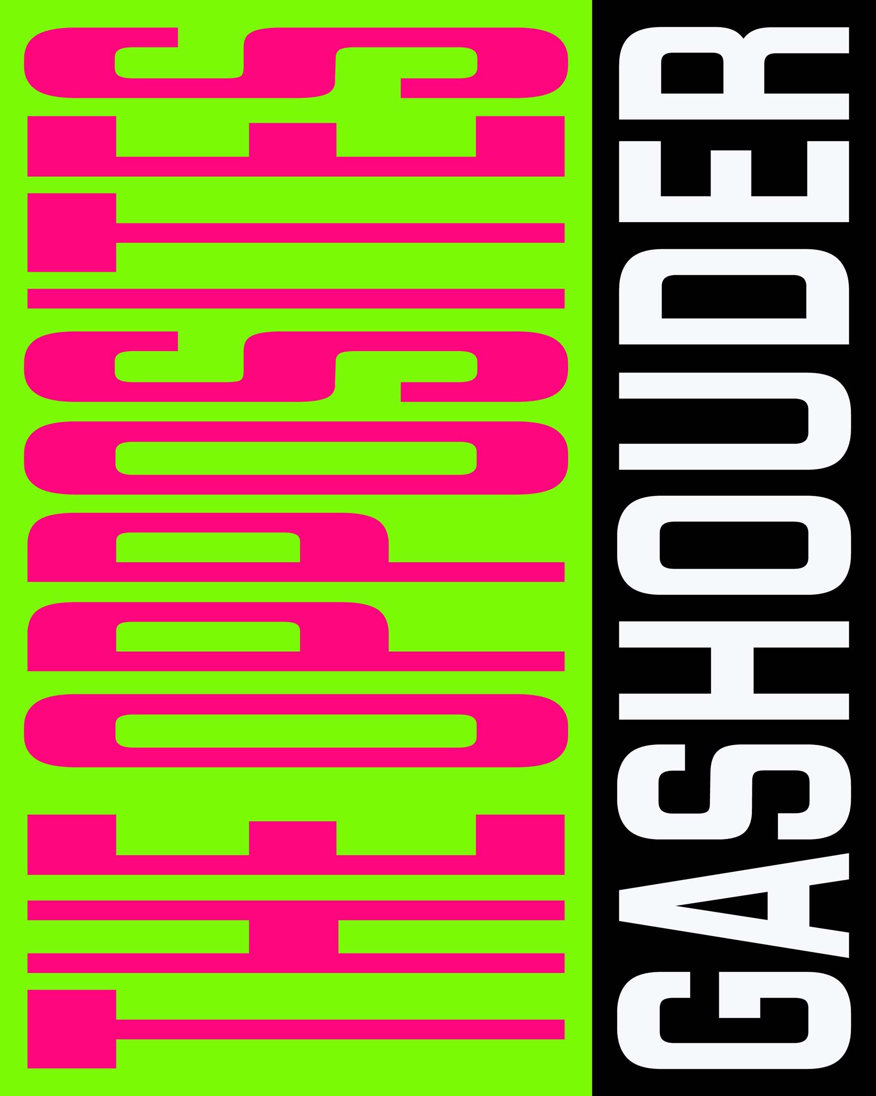
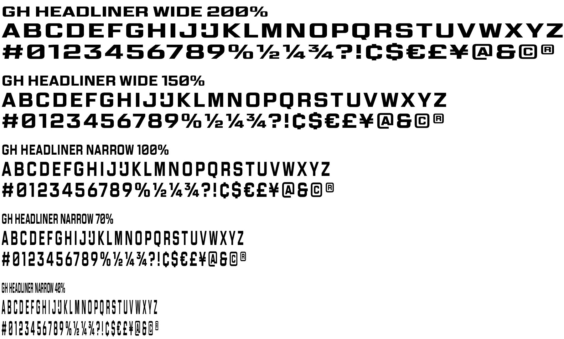
To achieve this, we designed two variable font families: GH Headliner Narrow and GH Headliner Wide. Together, they provide the extensive range of proportions needed to accommodate everything from long artist names to short headlines across posters, social media assets and other forms of communication.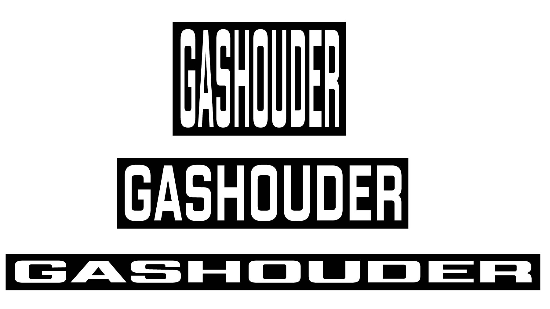
Gashouder now has an identity with a strong and recognisable stylistic imprint—one that pays homage to the golden age of nightclubbing while remaining firmly grounded in the level of typographic control and design direction expected today.