From Coin to Typeface: Designing for Het Muntgebouw
During the year 2025, we collaborated with The Stone Twins on the visual identity for Het Muntgebouw, the former Royal Dutch Mint in Utrecht, now transformed into a mixed-use cultural and business space. At the core of this project was the development of a bespoke typographic system, designed by Ramiro Espinoza, intended to connect the building’s new identity with its historical function.

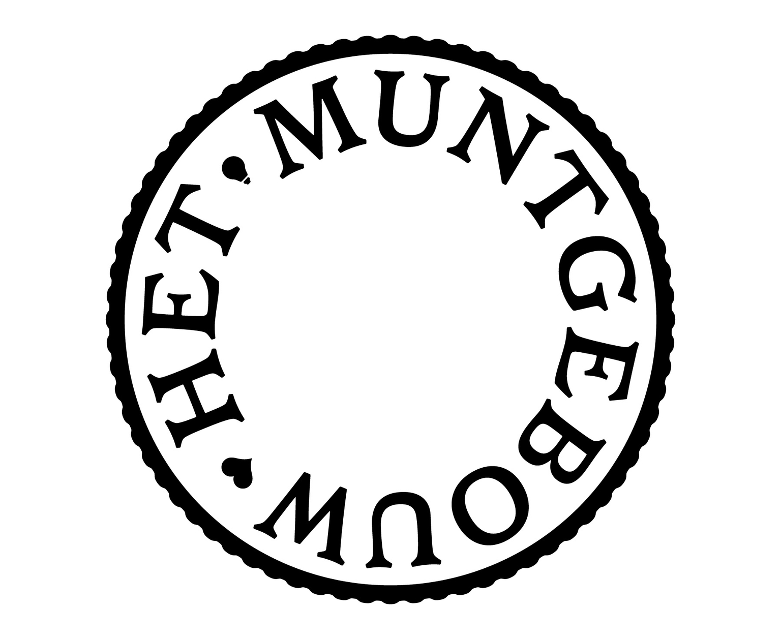
For this purpose, we based the custom lettering on the Juliana Guilder coin series, originally designed by Ludwig Oswald Wenckebach and minted in large quantities within the building itself. This reference established a direct link between the site’s past and its renewed role. One of the main challenges was adapting letterforms traditionally arranged along a circular baseline—typical of coin design—into a coherent typographic system suitable for contemporary branding.

Rather than reproducing the coin lettering literally, we translated its formal qualities—balance, proportion, and subtle modulation—into a functional alphabet. The result is a refined typographic voice that supports the identity across different applications while maintaining a strong connection to the building’s heritage.
This collaboration illustrates how custom lettering can contribute to heritage-driven branding, where historical references are reinterpreted to form a clear and contemporary visual language.
