Boer
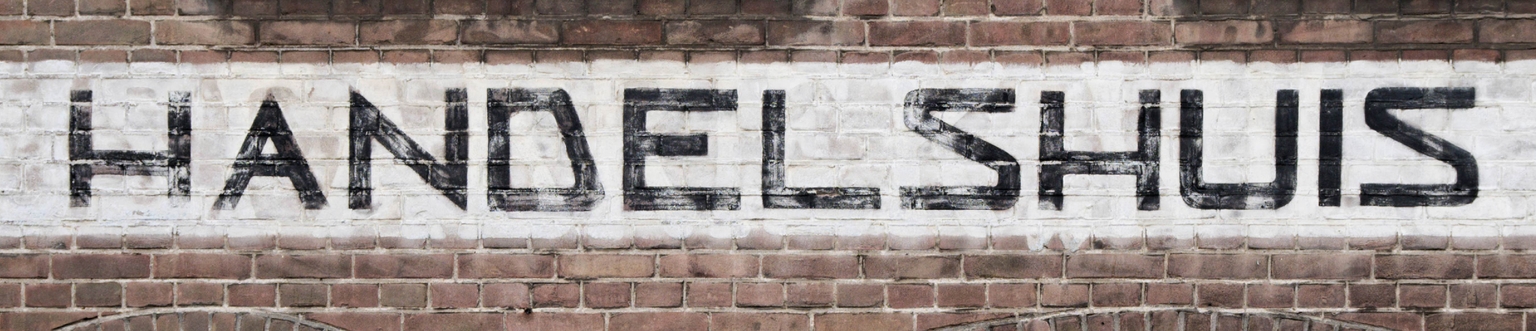
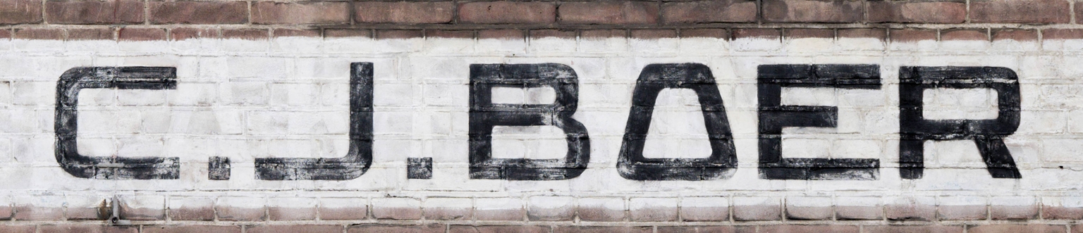
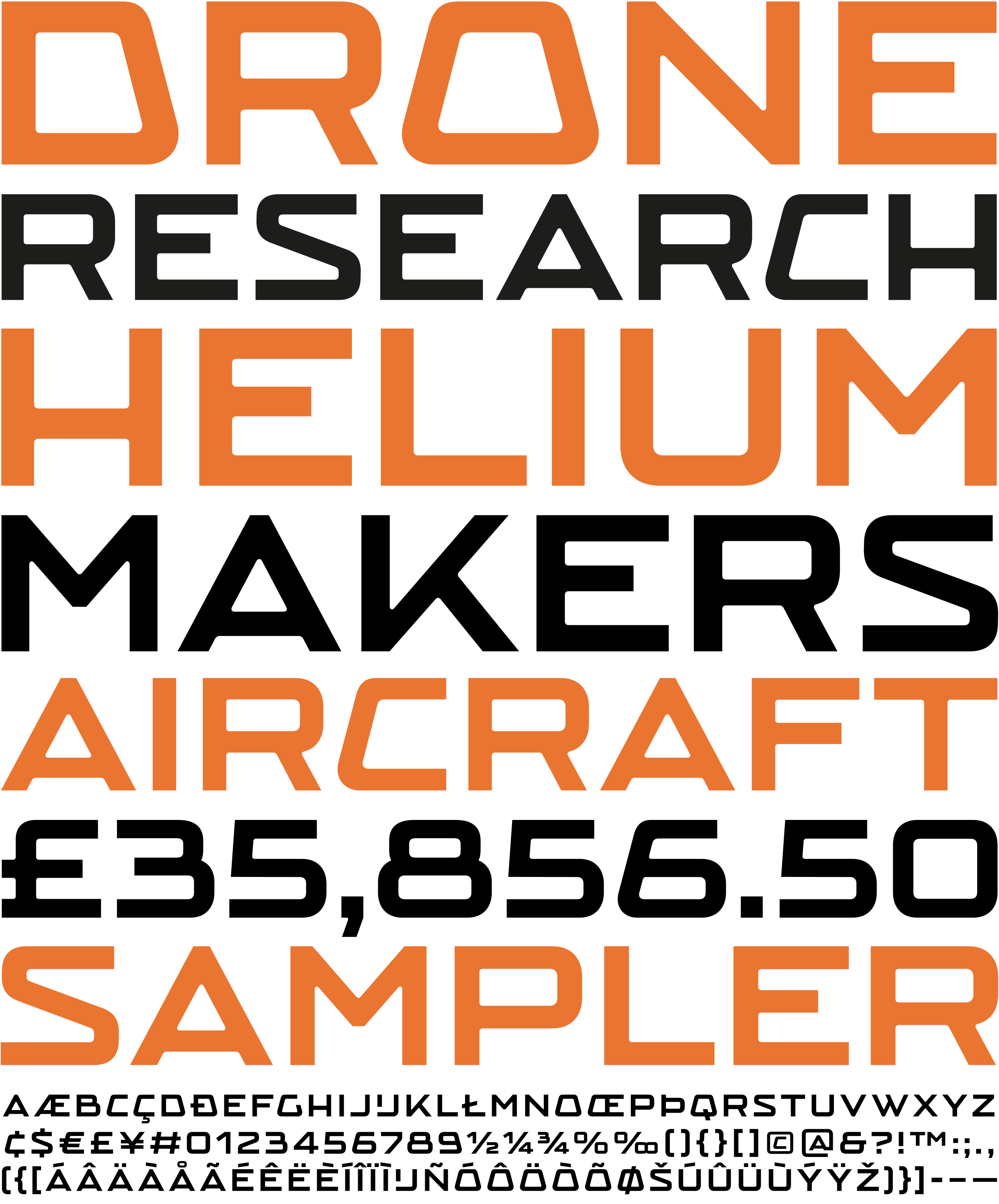
Boer is an expanded sans serif typeface by Ramiro Espinoza, inspired by the hand-painted lettering on the façade of the former Fa. C. J. Boer building at Vest 52–56 in Gouda, the Netherlands. The building was originally constructed in 1911 as the IJsfabriek Willem Barentsz (Willem Barentsz Ice Factory) and became the home of the trading company Fa. C. J. Boer in 1946. The distinctive façade lettering was most likely painted at that time. Its broad proportions, solid brushwork, and unusual construction—most notably the capital O with its slanted sides, which determines the shape of many rounded letters—give the alphabet a highly original character.
Espinoza studied the proportions, structure, and painted details of the original lettering and translated these qualities into a contemporary digital typeface. As with all Brutal Types releases, he refined the geometry, improved consistency, and expanded the character set for contemporary use while preserving the bold presence and handcrafted personality of the source.
With its wide proportions and distinctive forms, Boer is well suited for branding, editorial design, posters, signage, packaging, websites, and exhibition graphics. Its confident, industrial character also makes it particularly suitable for technology companies, engineering, manufacturing, and other technical or industrial subjects that benefit from a strong, memorable typographic voice.