DeUnie
- Regular
- SemiBold
- Bold
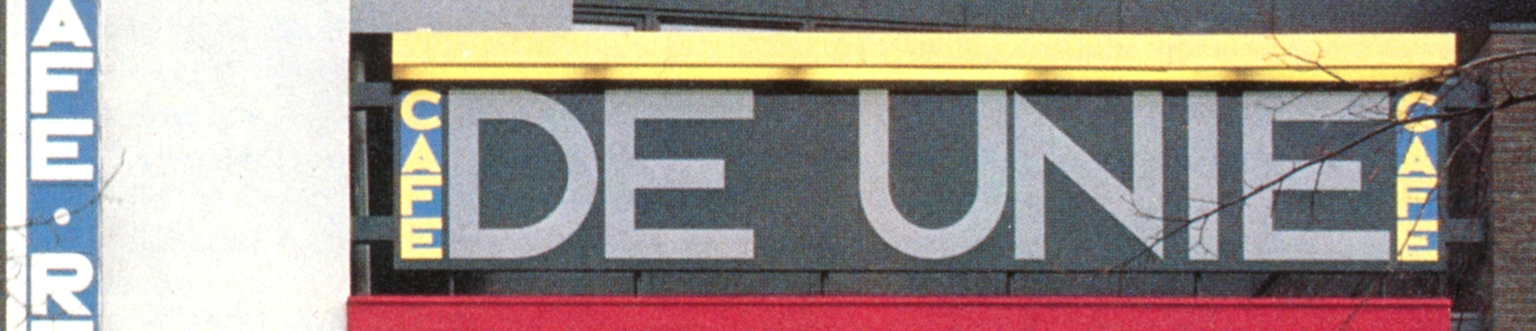
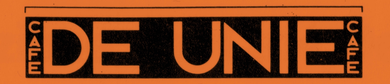
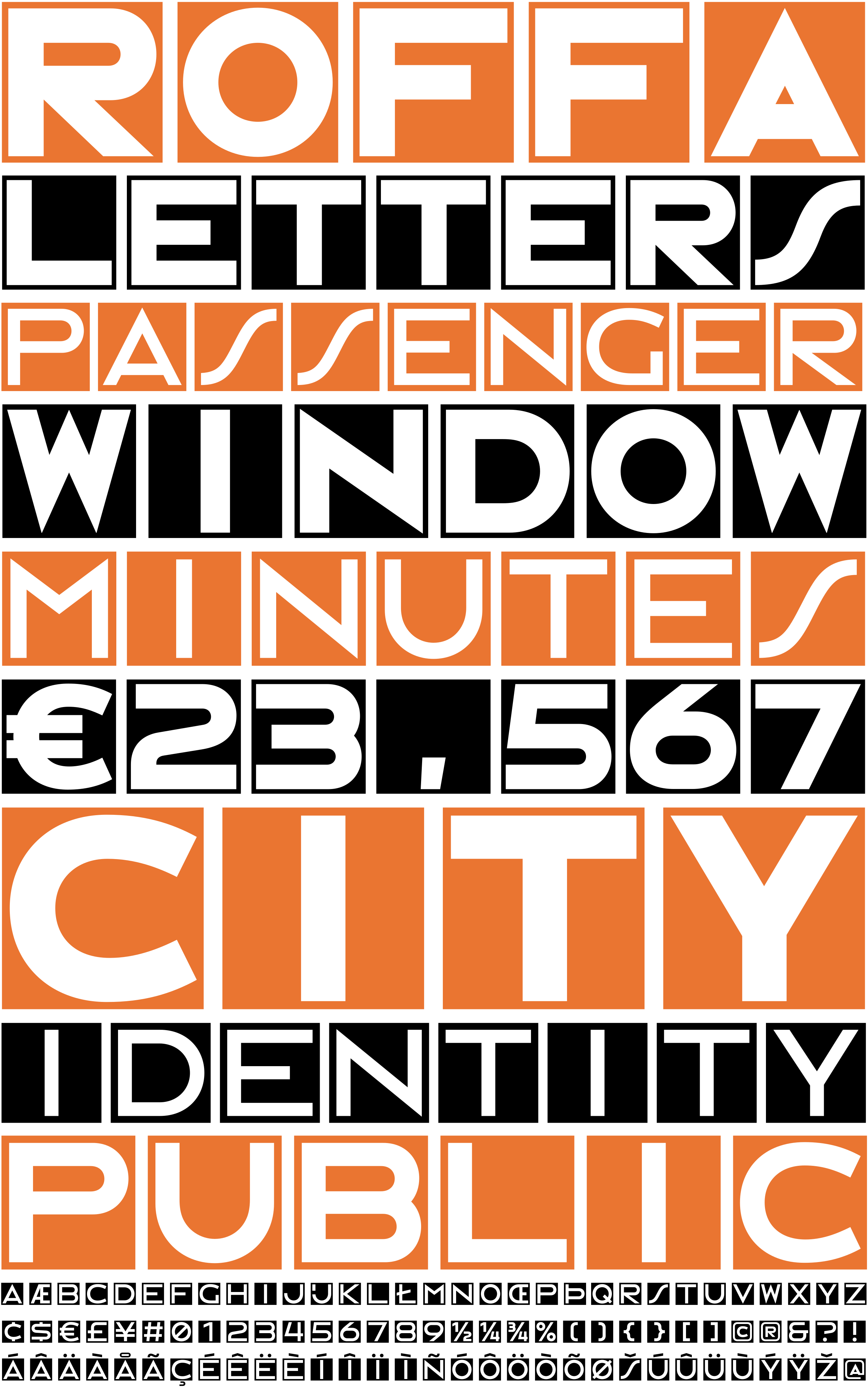
DeUnie is a display type family designed by Ramiro Espinoza and inspired by the lettering on the façade of Café De Unie, located at Mauritsweg 34 in Rotterdam, the Netherlands. Originally designed by architect J. J. P. Oud in 1925 as one of the best-known examples of De Stijl architecture, the building featured a distinctive geometric alphabet that formed an integral part of its visual identity.
Espinoza studied the proportions and modular construction of the original lettering and translated these qualities into a contemporary digital type family. Available in three weights, DeUnie offers greater typographic flexibility while remaining faithful to the architectural logic of the original design. Like the façade lettering that inspired it, the typeface can be used to set words vertically.
With its geometric structure and rational character, DeUnie is well suited for branding, editorial design, posters, signage, exhibition graphics, websites, and cultural projects that call for a clear, modernist typographic voice. Rooted in one of the defining works of Dutch modern architecture, the typeface brings the visual language of De Stijl to contemporary graphic design.