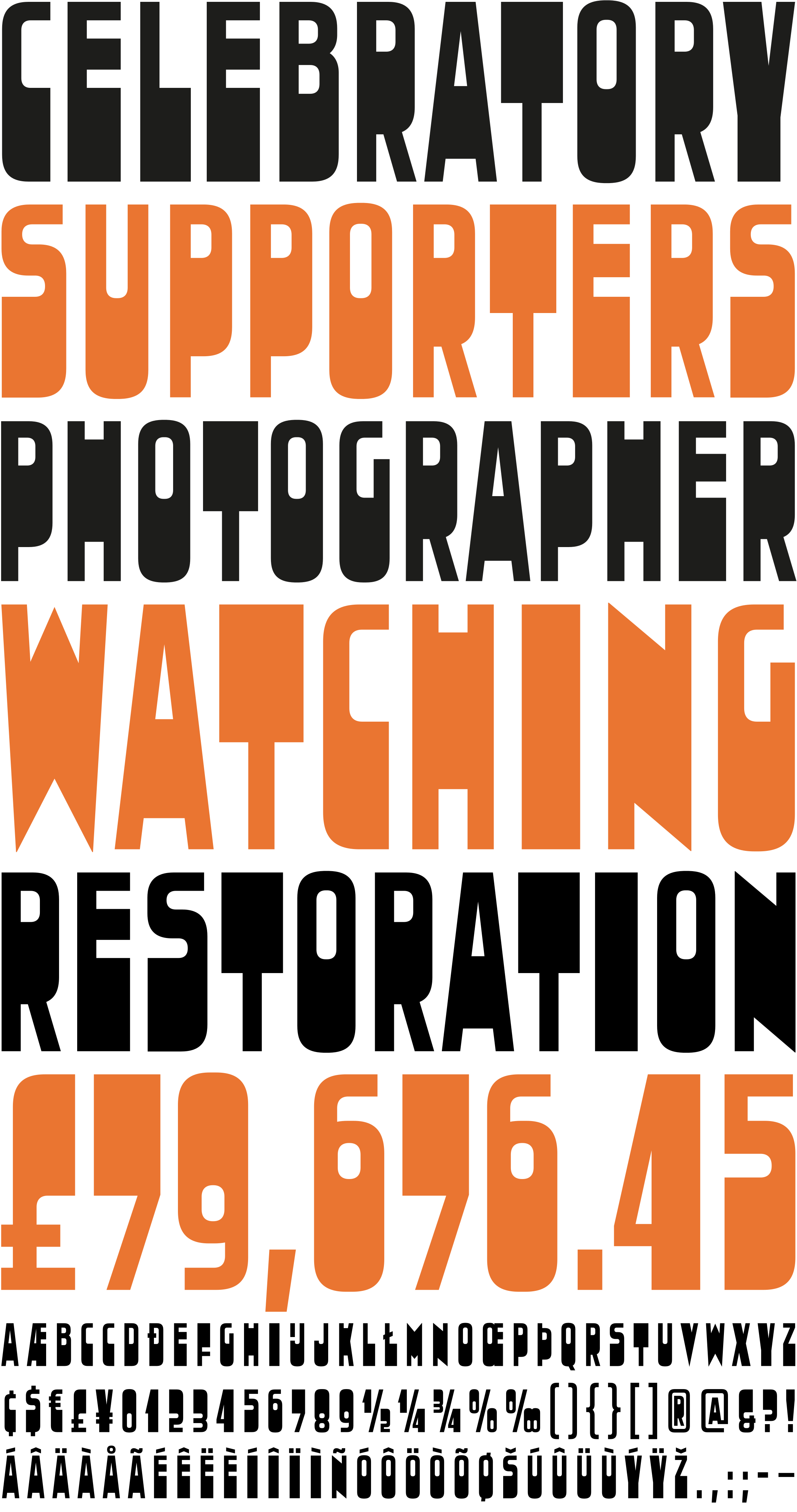
Dikehouse
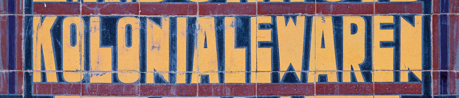
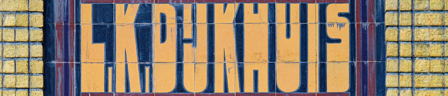
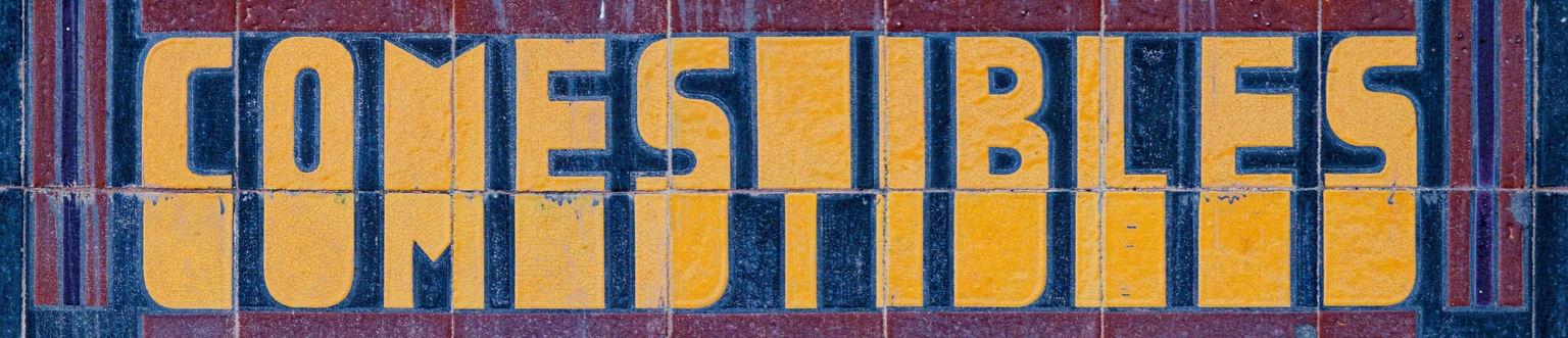
Dikehouse is an expressionist display typeface designed by Ramiro Espinoza and inspired by a ceramic tile sign located at the intersection of Tjark Jans Giezestraat and Molenstreek in Veendam, the Netherlands. The creator of the original work remains unknown, yet the composition is notable for its angular construction, geometric reduction, and dynamic rhythm. Built from simple formal principles, the inscription reflects the experimental approach present in much Dutch architectural typography of the interwar period.
Espinoza analyzed the proportions, modular logic, and distinctive shapes of the tiled characters and translated these qualities into a contemporary digital typeface. Rather than copying the source directly, he refined the geometry, regularized inconsistencies, and expanded the character set for present-day typographic use while preserving the energetic and irregular qualities that define the original composition.
With its sharp forms and architectural character, Dikehouse is suitable for posters, editorial work, signage, branding, websites, music-related graphics, and cultural projects that require a bold and unconventional typographic voice. Rooted in vernacular Dutch typography, the typeface connects historic architectural decoration with contemporary graphic design.