Kramer


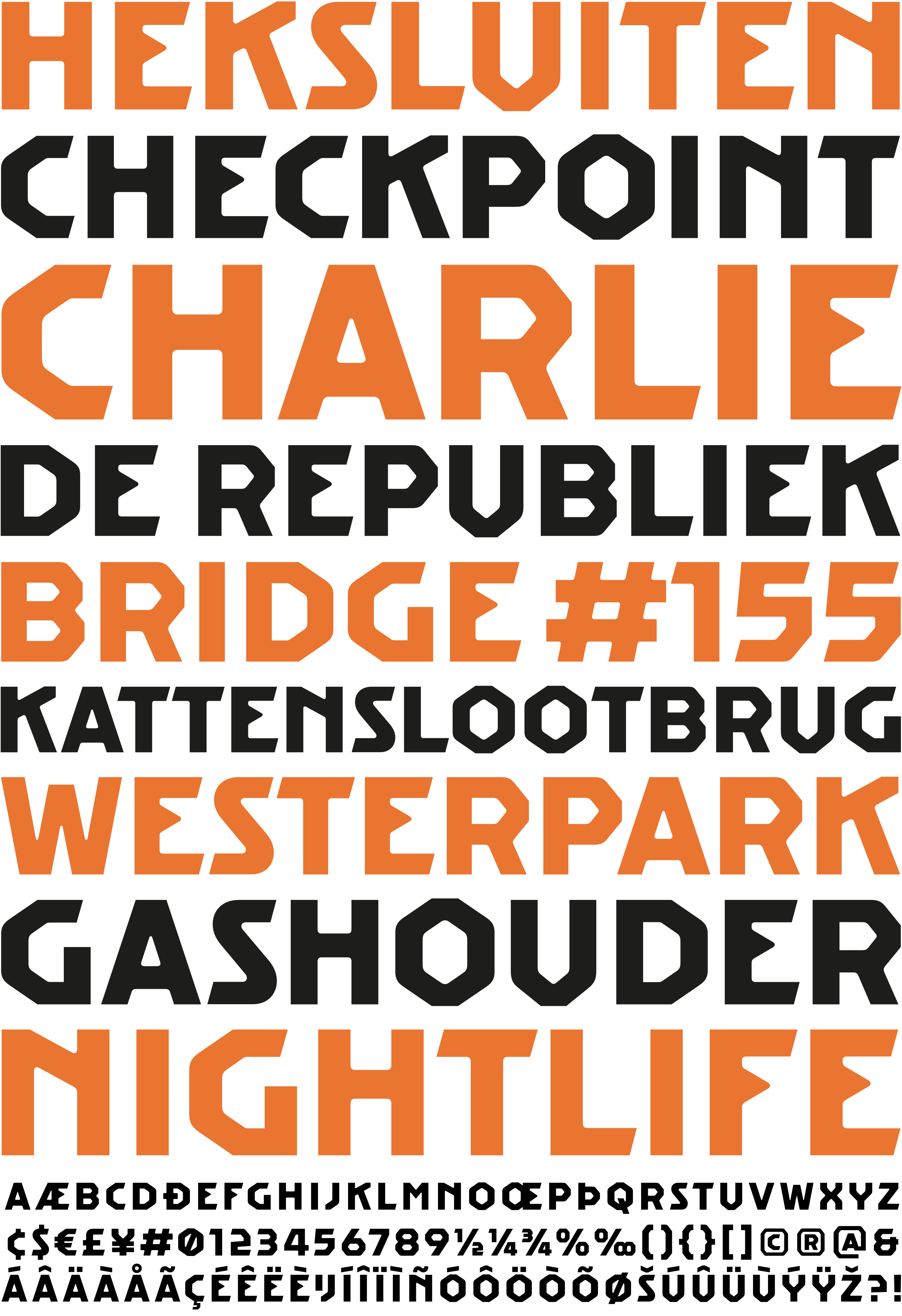
Kramer is an expressionist, modular display typeface by Ramiro Espinoza, inspired by the metal sign bearing the word “Heksluiten” on the Kattenslootbrug (Bridge #155), located on the oblique canal connection between the Kostverlorenvaart and the Singelgracht in Amsterdam, the Netherlands. The bridge was created by the renowned Dutch architect Piet Kramer, a leading figure of the Amsterdam School, and the sign itself was likely drawn by Kramer as well. The original letterforms combine geometric construction with expressive detailing, resulting in a distinctive alphabet that reflects the sculptural and decorative qualities associated with this influential architectural movement.
Espinoza studied the characteristic forms of the metal inscription and translated them into a contemporary digital typeface. Rather than reproducing the sign literally, he refined the geometry, improved consistency, and expanded the character set for contemporary use while preserving the expressive rhythm and visual identity of the source.
Kramer is well suited for branding, editorial design, posters, signage, packaging, websites, exhibition graphics, and cultural projects that benefit from a strong and distinctive typographic voice. Its origins also make it particularly suitable for projects related to design, architecture, urban culture, and the arts. Rooted in one of Amsterdam’s most recognizable traditions of public design, the typeface brings the visual language of the Amsterdam School into contemporary graphic practice.